Exploring the relation between cell shape and motility

Cell Morphology
Cell Migration
Differential Geometry
Author

Pavel Buklemishev

Published

December 20, 2024

In our previous proposal, we introduce our project to study how changes in cell shapes can be associated with motility and introduced our dataset. Here we report the methods and results we obtained in two main parts:

  1. Cell Spatial Migration:

    We visualize and classify the trajectories of motion for cell dataset.

  2. Shape Dynamics:

    We compute the Riemann distances over time and investigate characteristic events to understand cell shape behavior during migration. We also use conformal mapping to analyze protrusions and other shape features.

1. Cell Spatial Migration

Modes of migration

Cells exhibit different migration patterns, such as free diffusion, directed migration, and confined motion. Mean Squared Displacement (MSD) analysis was used to distinguish these modes. (Dieterich et al. 2008) (Rosen 2021) (Wikipedia, n.d.).

Mean squared displacement (MSD):

\[msd(t) = <[x(t+t_0) - x(t)]^2 + [y(t+t_0) - y(t)]^2> \]

Experimentally, the MSD depends on time in a polynomial way: \[ msd(t) = C t^{\alpha}\]

The motion types are described by the value of the parameter \(\alpha\)(Figure 1):

  • \(\alpha = 1\): Free Difusion.
  • \(\alpha = 2\): Directed Diffusion.
  • \(1 < \alpha < 2\): Superdiffusion.
  • \(\alpha <1\): Subdiffusion (anomalous diffusion, confined diffusion).
  • \(\alpha \approx 0\): Immobility
Figure 1: Diffusion types (Kapanidis, Uphoff, and Stracy 2018)

Using the trajectories, we aim to determine the motions type that appears in the trajectory of a cell and identify potential transitions between them. We discuss the trajectories analysis in the following sections.

Trajectories visualization

The cell can exhibit different diffusion behavior while migrating in space, thus, initially to investigate these modes of migration we need to visualize the cell trajectories. We visualize the cell trajectory using the following Python code(the dataset was initially adjusted Section 6.0.1):

Code

Code
def plot_cell_trajectory(n):
    centroids = centr[n - 1]  
    centroids = np.array(centroids)
    x_coords = centroids[:, 0]  
    y_coords = centroids[:, 1] 

    # riemann_data = riemann[n-1] 
    # riemann_data = np.array(riemann_data)  

    time_steps = np.arange(len(x_coords))  

    plt.figure(figsize=(10, 8))
    plt.scatter(
        x_coords[0], y_coords[0],  
        c='black',
        marker='o',
        edgecolor='k',
        s=100,
        alpha=0.7,
        label='Start Point'
    )
    scatter = plt.scatter(
        x_coords[1:], y_coords[1:],  
        c=time_steps[1:],  #riemann_data[1:],        
        cmap='plasma',             
        marker='o',
        edgecolor='k',
        s=100,
        alpha=0.7
    )
    plt.plot(x_coords, y_coords, linestyle='-', color='gray', alpha=0.5)  

    plt.title(f"Cell Num {n}")
    plt.xlabel('X Coordinate')
    plt.ylabel('Y Coordinate')
    plt.grid(True)

    cbar = plt.colorbar(scatter)
    cbar.set_label('Time Step (t)', rotation=270, labelpad=15)

    plt.show()
Figure 2: The cell №87 trajectory

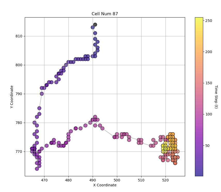
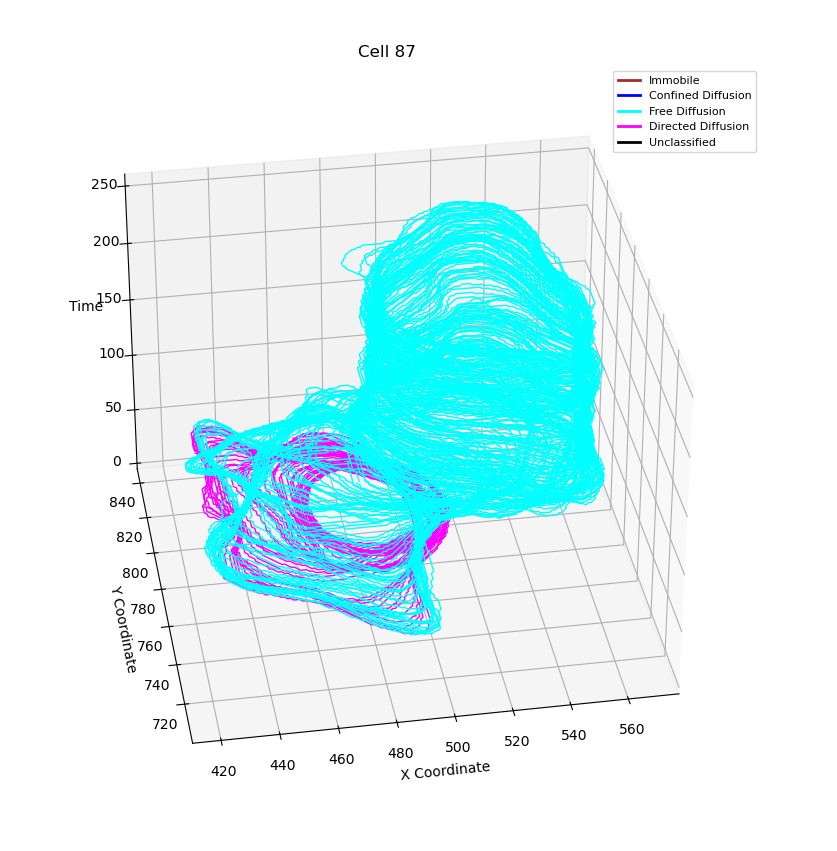
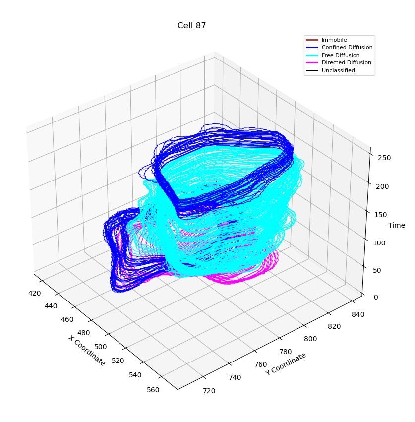
We build the trajectories of the cells of the whole dataset. In the example figure(Figure 2) one can see the trajectory of the cell №87. However, building trajectories itself doesn’t give an answer which modes a cell exhibits. Thus, we need to formulate and demonstrate a technique that help as to segmentize and classify the modes.

All the trajectories pdf

Trajectory classification.

DC-MSS - divide-and-conquer moment scaling spectrum transient mobility analysis framework (Vega et al. 2018) which classifies trajectory segments into predefined motion types and detects mobility switches. In our project, we use this tool to describe the trajectories of cells. Although this method is powerful and efficient for classifying trajectories, it has its cons as well. As it was designated for the molecular motion analysis it doesn’t take into account superdiffusion mode which is more typical for living species. Thus, method distinguishes between free diffusion, confined motion, immobility, and directed migration, and we will assume that if a cell exhibits superdiffusion mode, it will be covered by the lattest one.

After converting data to the framework format we can get desired mode classification.

Running the DC-MSS Framework in MATLAB

After preparing data for the framework(Section 6.0.2) we process the classification.

Code
loaded = load("../trajectory_data.mat");
allTracks = loaded.tracks;

probDim = 2;       
plotRes = 0;       
peakAlpha = 95;  

results = struct();

trackNames = fieldnames(allTracks);
for i = 1:length(trackNames)
    trackName = trackNames{i};
    tracks = allTracks.(trackName);

    [transDiffResults, errFlag] = basicTransientDiffusionAnalysisv1(tracks, probDim, plotRes, peakAlpha);
    
    if isfield(transDiffResults.segmentClass, 'momentScalingSpectrum')
        results.(trackName).momentScalingSpectrum = transDiffResults.segmentClass.momentScalingSpectrum;
    end
end

h5FileName = 'time_events.h5';

trackNames = fieldnames(results);
for i = 1:length(trackNames)
    trackName = trackNames{i};
    data = results.(trackName).momentScalingSpectrum;
end

By varying peakAlpha parameter one can get different confidence level for choosing peaks when initially segmenting track.

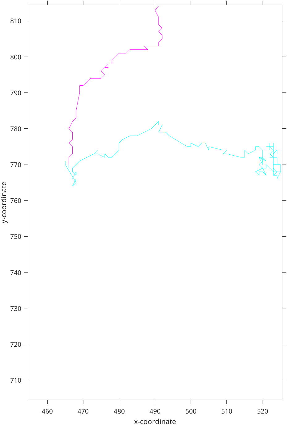
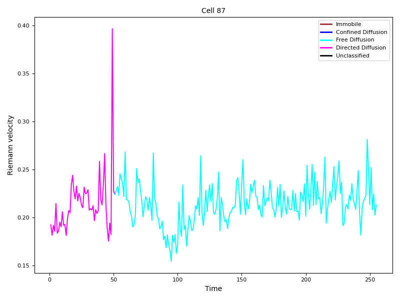
Figure 3: Classified track with 95% confidence level. Cyan corresponds to the free diffusion, Magenta - directed motion
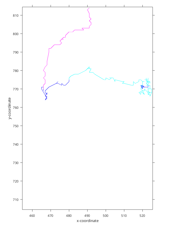
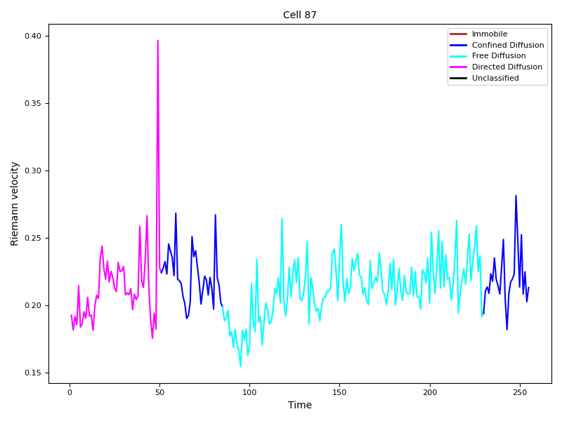
Figure 4: Classified track with 90% confidence level. Blue corresponds to the confined diffusion

In the example (Figure 3 and Figure 4) we can see that the classified trajectory segments provide insights into motion types. However, (Figure 4) looks much more natively as the motion changes in the cyan part of trajectory(Figure 3) are visible to the naked eye.

Dataset Motion Modes Analysis

In this section, we organize the dataset based on the migration modes classification discussed in the previous sections.

First, we will estimate the proportion of each observed migration mode relative to the total.

Motion Modes Distribution

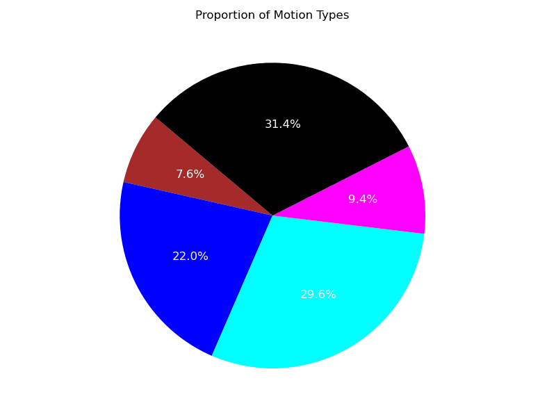
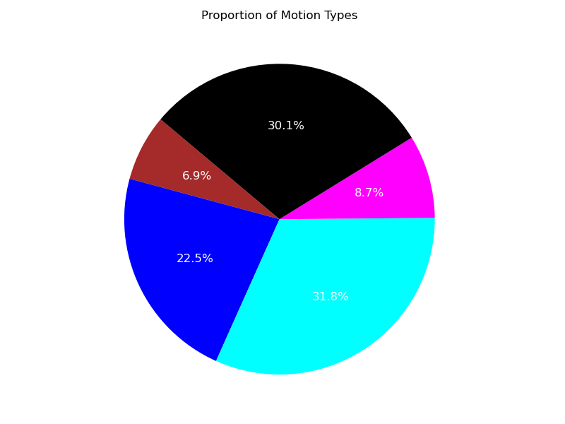
Using the illustrations (Figure 5, Figure 6), it is evident that, despite the presence of unclassified trajectory segments, the two predominant regimes describing the trajectories are the free and confined migration modes.

Code
def get_motion_type_distribution():
    type_counts = defaultdict(int)
    total_count = 0

    with h5py.File('time_events_95.h5', 'r') as f:
        for plot_index in range(total_plots):
            track_i_data = f[f'/track_{plot_index+1}'][:]
            first_three_rows = track_i_data[:3]
            interval_types = first_three_rows[2, :]
            
            for interval_type in interval_types:
                if not np.isnan(interval_type):
                    type_counts[int(interval_type)] += 1
                    total_count += 1
                else:
                    type_counts["unclassified"] += 1
                    total_count += 1

    proportions = {key: count / total_count for key, count in type_counts.items()}
    return proportions

def plot_motion_type_distribution():

    proportions = get_motion_type_distribution()


    types = ["Immobile", "Confined Diffusion", "Free Diffusion", "Directed Diffusion", "Unclassified"]
    colors = ["brown", "blue", "cyan", "magenta", "black"]
    keys = [0, 1, 2, 3, "unclassified"]

    values = [proportions.get(key, 0) for key in keys]
    plt.figure(figsize=(8, 6))
    plt.pie(
        values,
        labels=types,
        colors=colors,
        autopct="%1.1f%%",
        startangle=140,
        textprops={'color': 'white', 'fontsize': 12}  
    )
    plt.title("Proportion of Motion Types")
    plt.tight_layout()
    plt.savefig("motion_type_distribution_90.png")
    plt.show()
Figure 5: Confidence level 0.95. Cyan corresponds to the free diffusion, Magenta - directed motion, Blue - confined diffusion, Brown - to immobile cells, Black - unclassified.
Figure 6: Confidence level 0.90.

Transition between Modes Matrix

The transition fractions of mode switches can also be represented using a Transition Matrix. These matrices (Figure 7, Figure 8) illustrate the most frequent transitions between migration modes, offering valuable insight into the dynamics of mode switching. From these illustrations, we can draw the following conclusions:

  1. Probabilities of the transition from one mode to another usually depends on the direction of a transition.

  2. The most dominant mode transition is from free diffusion to the confined mode.

  3. Cells tend to switch between modes in a sequential manner, following the pattern: Immobile → Confined → Free → Directed and in the opposite direction.

Code
def compute_transition_matrix_with_unclassified():
    transition_counts = np.zeros((5, 5))  
    total_transitions = 0

    with h5py.File('time_events_95.h5', 'r') as f:
        for plot_index in range(total_plots):
            track_i_data = f[f'/track_{plot_index+1}'][:]
            first_three_rows = track_i_data[:3]
            interval_types = first_three_rows[2, :]

            for start_idx in range(len(interval_types) - 1):
                type_from = interval_types[start_idx]
                type_to = interval_types[start_idx + 1]


                type_from = int(type_from) if not np.isnan(type_from) else 4  
                type_to = int(type_to) if not np.isnan(type_to) else 4  

                if type_from != type_to:  
                    transition_counts[type_from, type_to] += 1
                    total_transitions += 1


    transition_matrix = (transition_counts / total_transitions) * 100  
    return transition_matrix

def plot_transition_matrix_with_unclassified(transition_matrix):
    types = ["Immobile", "Confined Diffusion", "Free Diffusion", "Directed Diffusion", "Unclassified"]
    
    plt.figure(figsize=(8, 6))
    masked_matrix = np.ma.masked_where(np.eye(len(types)), transition_matrix)  
    plt.imshow(masked_matrix, cmap="Blues", aspect="auto")
    for i in range(5):
        plt.fill([i - 0.5, i + 0.5, i + 0.5, i - 0.5],
                 [i - 0.5, i - 0.5, i + 0.5, i + 0.5],
                 color='black')

    plt.colorbar(label="%")

    plt.xticks(ticks=np.arange(len(types)), labels=types, rotation=45)
    plt.yticks(ticks=np.arange(len(types)), labels=types)
    plt.title("Transition Matrix")


    for i in range(len(types)):
        for j in range(len(types)):
            if i != j:  
                plt.text(j, i, f"{transition_matrix[i, j]:.1f}%", ha='center', va='center', color='black')

    plt.tight_layout()
    plt.savefig("transition_matrix_with_unclassified_95.png")
    plt.show()
Figure 7: Confidence level 0.95. The Y-axis represents the migration mode from which cells transition to a new observed mode, while the X-axis corresponds to the mode they transition into.
Figure 8: Confidence level 0.90.

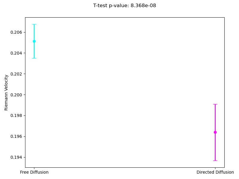
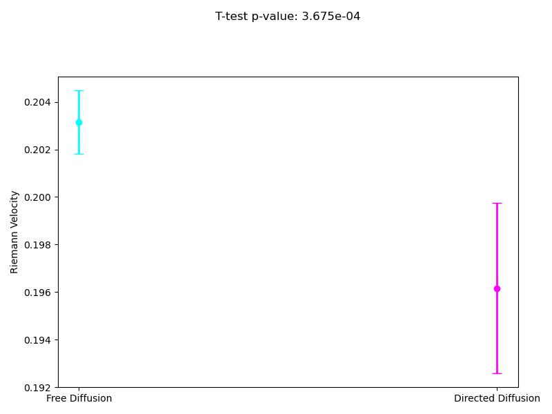
Free and Directed Diffusion: average velocities

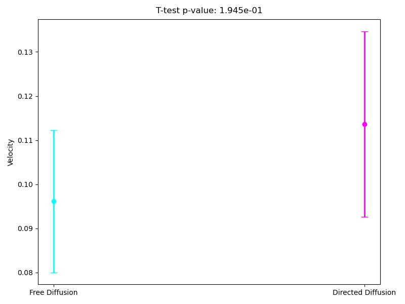
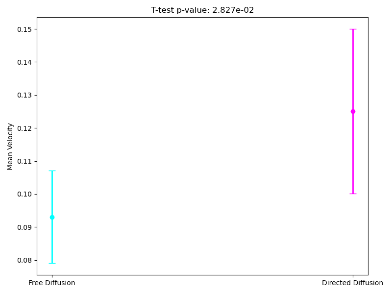
Since the most interpretable regimes for observers are free diffusion and directed motion, in the following subsections, we investigate cell motility characteristics concerning these two modes. We compute the mean velocities associated with these migration modes, presenting both the mean values and their 95% confidence intervals. Unfortunately, the p-value for the t-test at the 95% confidence level segmentation(Figure 9) exceeds the required 0.05, which limits the statistical significance of the observed differences. However, the segmentation at the 90% confidence level demonstrates statistical significance for the observed velocities. As we can see in (Figure 10), the velocity in directed migration is higher than in free diffusion. This can be explained by the active mechanisms involved in directed migration, such as the reorganization of the cytoskeleton, enhanced energy expenditure, which result in more efficient and faster movement compared to the random free diffusion.

Code
def average_velocity_with_ttest():
    type_data = defaultdict(list)

    with h5py.File('time_events_95.h5', 'r') as f:
        for plot_index in range(total_plots):
            track_i_data = f[f'/track_{plot_index+1}'][:]
            first_three_rows = track_i_data[:3]
            event_indices = first_three_rows[0, :].astype(int) - 1
            interval_types = first_three_rows[2, :]

            for start_idx, interval_type in enumerate(interval_types):
                if start_idx + 1 < len(event_indices) and interval_type in [2, 3]:                      start = event_indices[start_idx] + 1  
                    end = event_indices[start_idx + 1]
                    segment = [get_abs_velocity(plot_index, idx) for idx in range(start, end + 1)]
                    type_data[int(interval_type)].extend(segment)

 
    free_diffusion = type_data[2]
    directed_diffusion = type_data[3]

    t_stat, p_value = ttest_ind(free_diffusion, directed_diffusion, equal_var=False)


    plt.figure(figsize=(8, 6))
    types = ["Free Diffusion", "Directed Diffusion"]
    colors = ["cyan", "magenta"]
    means = []
    conf_intervals = []

    for key, velocities in zip([2, 3], [free_diffusion, directed_diffusion]):
        if velocities:  
            mean = np.mean(velocities)
            ci = sem(velocities) * 1.96  
            means.append(mean)
            conf_intervals.append(ci)
        else:
            means.append(0)
            conf_intervals.append(0)

    x = np.arange(len(types))

    for idx, (mean, ci, color) in enumerate(zip(means, conf_intervals, colors)):
        plt.errorbar(x[idx], mean, yerr=ci, fmt='o', color=color, ecolor=color, elinewidth=2, capsize=5)

    plt.text(0.5, max(means) + max(conf_intervals) * 1.2,
             f"T-test p-value: {p_value:.3e}",
             ha='center', fontsize=12, color='black')

    plt.xticks(x, types)
    plt.ylabel("Velocity")
    plt.tight_layout()
    plt.savefig("mean_velocity_with_ttest_95.png")
    plt.show()
Figure 9: Confidence level 0.95.
Figure 10: Confidence level 0.90.

Free and Directed Diffusion: average angles

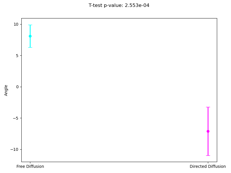
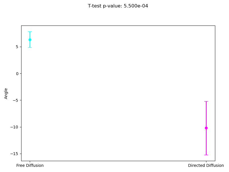
Analogously to the previous subsection, we measured the average directional angles associated with different migration modes. Both segmentation levels satisfy the p-value criterion, confirming the statistical significance of the results. From both images, it is evident that cells exhibit more stable behavior in the directed diffusion mode, with noticeably less rotational movement.

Code
def average_angle_with_ttest():
    type_data = defaultdict(list)

    with h5py.File('time_events_90.h5', 'r') as f:
        for plot_index in range(total_plots):
            track_i_data = f[f'/track_{plot_index+1}'][:]
            first_three_rows = track_i_data[:3]
            event_indices = first_three_rows[0, :].astype(int) - 1
            interval_types = first_three_rows[2, :]

            for start_idx, interval_type in enumerate(interval_types):
                if start_idx + 1 < len(event_indices) and interval_type in [2, 3]:                      start = event_indices[start_idx] + 1 
                    end = event_indices[start_idx + 1]
                    segment = [get_velocity_angle_rel(plot_index, idx) for idx in range(start, end + 1)]
                    type_data[int(interval_type)].extend(segment)

    free_diffusion = type_data[2]
    directed_diffusion = type_data[3]

    t_stat, p_value = ttest_ind(free_diffusion, directed_diffusion, equal_var=False)


    plt.figure(figsize=(8, 6))
    types = ["Free Diffusion", "Directed Diffusion"]
    colors = ["cyan", "magenta"]
    means = []
    conf_intervals = []

    for key, angles in zip([2, 3], [free_diffusion, directed_diffusion]):
        if angles: 

            sigma = 2
            angles_smoothed = gaussian_filter1d(angles, sigma=sigma)

            mean = np.mean(angles_smoothed)
            ci = sem(angles_smoothed) * 1.96 
            means.append(mean)
            conf_intervals.append(ci)
        else:
            means.append(0)
            conf_intervals.append(0)

    x = np.arange(len(types))


    for idx, (mean, ci, color) in enumerate(zip(means, conf_intervals, colors)):
        plt.errorbar(x[idx], mean, yerr=ci, fmt='o', color=color, ecolor=color, elinewidth=2, capsize=5)

    plt.text(0.5, max(means) + max(conf_intervals) * 1.2,
             f"T-test p-value: {p_value:.3e}",
             ha='center', fontsize=12, color='black')

    plt.xticks(x, types)
    plt.ylabel("Angle")
    plt.tight_layout()
    plt.savefig("mean_angle_with_ttest_90.png")
    plt.show()
Figure 11: Confidence level 0.95.
Figure 12: Confidence level 0.90.

2. Shape analysis

After describing the spatial migration of a cell, our next goal is to investigate the dynamics of its shape. We employ the SRV Riemann Elastic Metrics to compute the distance between two shapes(Li et al. 2023):

\[ g_c^{1, 0.5}(h, k) = \int_{[0,1]} \langle D_s h, N \rangle \langle D_s k, N \rangle \, ds + 0.5^2 \int_{[0,1]} \langle D_s h, T \rangle \langle D_s k, T \rangle \, ds \text{ - SRV metrics} \]

For a single cell given time moments \(t\) and \(t+1\), we:

  1. Interpolate the segmentized cell shape for both of moments t and t+1

  2. Align the cell shapes. We quotient out transition and reparametrization but ignore the rotation. We expect that the rotation is a significant aspect in spatial migration and we need to focus it.

  3. Compute the SRV metrics for an each couple of consequent aligned cell shapes(Section 6.0.3), dividing them by time differences, and, therefore we obtain Riemann Velocities (They would be mentioned in the text as distances as well).

Distance Computation

Riemann distances are computed between consequent aligned shapes:

Code
riemann_distances = []
a = 1
b = 1/2

CURVES_SPACE_ELASTIC = DiscreteCurvesStartingAtOrigin(
    ambient_dim=2, k_sampling_points=1000, equip=False
)
CURVES_SPACE_ELASTIC.equip_with_metric(ElasticMetric, a=a, b=b)

def calculate_distance(border,reference_shape):

    return CURVES_SPACE_ELASTIC.metric.dist(CURVES_SPACE_ELASTIC.projection(border), CURVES_SPACE_ELASTIC.projection(reference_shape))


for cell_i in range(1, 205):
    number_of_frames = sum(os.path.isdir(os.path.join(f"cells/cell_{cell_i}", entry)) for entry in os.listdir(f"cells/cell_{cell_i}"))  

    iter_distance = np.zeros(number_of_frames)

    BASE_LINE = np.load(f'cells/cell_{cell_i}/frame_1/outline.npy')
    BASE_LINE= interpolate(BASE_LINE,1000)
    BASE_LINE = preprocess(BASE_LINE)
    BASE_LINE= project_on_kendall_space(BASE_LINE)
    for i in range(number_of_frames):
        border_cell = np.load(f'cells/cell_{cell_i}/frame_{i+1}/outline.npy')
        cell_interpolation= interpolate(border_cell,1000)
        cell_preprocess = preprocess(cell_interpolation)
        border_cell = cell_preprocess
        border_cell = project_on_kendall_space(cell_interpolation)
        aligned_border = align(border_cell, BASE_LINE, rescale=True, rotation=False, reparameterization=True, k_sampling_points=1000)
        iter_distance[i] = calculate_distance(aligned_border, BASE_LINE)
        BASE_LINE = aligned_border 

    riemann_distances.append(iter_distance)
### Dividing by delta t in the results.

Riemann Velocities visualization - (Section 6.0.4).

Moreover, we hypothesize that the cells’ shape dynamics, as described by Riemann Velocities, are influenced by the migration mode they exhibit. Therefore, we align the Riemann Velocities with the mode segmentation obtained earlier for further analysis.

Riemann Velocities visualization with segmentation - (Section 6.0.5).

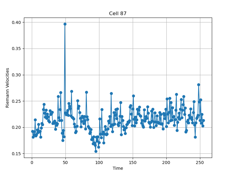
From the example pictures (Figure 13, Figure 14), the peak at time point 49 aligns well with the observed transition in migration modes, suggesting that a connection may exist.

Figure 13: Confidence level 0.95.
Figure 14: Confidence level 0.90.

Based on the general results, we can formulate a hypothesis: Riemann velocity peaks emerge when the motion mode switches between Directed Diffusion and Confined/Free Diffusion modes. However, with the current data, we cannot confidently confirm this correlation. Nevertheless, some examples (e.g., cells №33, 36, 41, 57, etc.) suggest that this dependency could be a promising target for future exploration.

All the Riemann Velocities pdf

Riemann velocities and events (0.9 confidence level)

Riemann velocities and events (0.95 confidence level)

Riemann velocities and classified segments (0.9 confidence level)

Riemann velocities and classified segments (0.95 confidence level)

We can visualize the spatial behaviour of a cell via the motion types as well (Figure 15, Figure 16). This could be helpful in the further research.

Code
def plot_cell_by_motion_type(n):

    cell_dir = 'cells'
    cell_path = os.path.join(
        cell_dir, 
        sorted(os.listdir(cell_dir), key=lambda x: int(x.split('_')[1]) if '_' in x and x.split('_')[1].isdigit() else 0)[n-1]
    )

    cell = sorted(
        os.listdir(cell_path), 
        key=lambda x: int(''.join(filter(str.isdigit, x))) 
    )
    
    fig = plt.figure()
    ax = fig.add_subplot(111, projection='3d')

    interval_colors = {
        0: "brown", 
        1: "blue",       
        2: "cyan",       
        3: "magenta",  
        "unclassified": "black"  
    }
    import h5py

    with h5py.File('time_events_90.h5', 'r') as f:
        track_i_data = f[f'/track_{n}'][:]
        first_three_rows = track_i_data[:3]
        event_indices = first_three_rows[0, :].astype(int) - 1
        interval_types = first_three_rows[2, :]  

    for i, frame in enumerate(cell):
        frame_path = os.path.join(cell_path, frame)
        time = np.load(os.path.join(frame_path, 'time.npy'))
        outline = np.load(os.path.join(frame_path, 'outline.npy'))

        current_type = None
        for start_idx, interval_type in enumerate(interval_types):
            if i >= event_indices[start_idx] and (start_idx + 1 == len(event_indices) or i < event_indices[start_idx + 1]):
                current_type = interval_type
                break

        if current_type is not None:
            interval_type = int(current_type) if not np.isnan(current_type) else "unclassified"
            color = interval_colors.get(interval_type, "black")

        ax.plot3D(
            outline[:, 0], 
            outline[:, 1], 
            np.full(len(outline[:, 1]), time),
            color=color, 
            linewidth=1
        )
        print(f"Frame {frame}: Time = {time}, Motion Type = {current_type}")

    from matplotlib.lines import Line2D
    legend_elements = [
        Line2D([0], [0], color="brown", lw=2, label="Immobile"),
        Line2D([0], [0], color="blue", lw=2, label="Confined Diffusion"),
        Line2D([0], [0], color="cyan", lw=2, label="Free Diffusion"),
        Line2D([0], [0], color="magenta", lw=2, label="Directed Diffusion"),
        Line2D([0], [0], color="black", lw=2, label="Unclassified")
    ]
    ax.legend(handles=legend_elements, loc="upper right", fontsize=8)

    ax.set_xlabel('X Coordinate')
    ax.set_ylabel('Y Coordinate')
    ax.set_zlabel('Time')
    ax.set_title(f"Cell {n}")
    plt.show()
Figure 15: Confidence level 0.95.
Figure 16: Confidence level 0.90.

Free and Directed Diffusion: Riemann Velocities

In this section, similar to (Section 1.1.3, Section 1.1.4), we compute the mean values of Riemann Velocities associated with Free and Directed Diffusion modes.

The figures (Figure 17, Figure 18) illustrate that during directed migration, cells exhibit fewer shape perturbations compared to free diffusion modes. This suggests that the cytoskeleton in cells undergoing directed migration is more stable than in cells in diffusive modes.

Code
def average_riemann_distances_with_ttest():
    type_data = defaultdict(list)

    with h5py.File('time_events_90.h5', 'r') as f:
        for plot_index in range(total_plots):
            track_i_data = f[f'/track_{plot_index+1}'][:]
            first_three_rows = track_i_data[:3]
            event_indices = first_three_rows[0, :].astype(int) - 1
            interval_types = first_three_rows[2, :]

            for start_idx, interval_type in enumerate(interval_types):
                if start_idx + 1 < len(event_indices) and interval_type in [2, 3]: 
                    start = event_indices[start_idx] + 1  
                    end = event_indices[start_idx + 1]
                    segment = [
                        get_riemann_dist(plot_index, idx) /
                        (get_times(plot_index, idx) - get_times(plot_index, idx - 1))
                        for idx in range(start, end + 1)
                    ]
                    type_data[int(interval_type)].extend(segment)

    free_diffusion = type_data[2]
    directed_diffusion = type_data[3]


    t_stat, p_value = ttest_ind(free_diffusion, directed_diffusion, equal_var=False)

    plt.figure(figsize=(8, 6))
    types = ["Free Diffusion", "Directed Diffusion"]
    colors = ["cyan", "magenta"]
    means = []
    conf_intervals = []

    for key, distances in zip([2, 3], [free_diffusion, directed_diffusion]):
        if distances:  
            mean = np.mean(distances)
            ci = sem(distances) * 1.96  
            means.append(mean)
            conf_intervals.append(ci)
        else:
            means.append(0)
            conf_intervals.append(0)

    x = np.arange(len(types))

    for idx, (mean, ci, color) in enumerate(zip(means, conf_intervals, colors)):
        plt.errorbar(x[idx], mean, yerr=ci, fmt='o', color=color, ecolor=color, elinewidth=2, capsize=5)

    plt.text(0.5, max(means) + max(conf_intervals) * 1.2,
             f"T-test p-value: {p_value:.3e}",
             ha='center', fontsize=12, color='black')

    plt.xticks(x, types)
    plt.ylabel("Riemann Velocity")

    plt.tight_layout()
    plt.savefig("riemann_distances_with_ttest_90.png")
    plt.show()
Figure 17: Confidence level 0.95.
Figure 18: Confidence level 0.90.

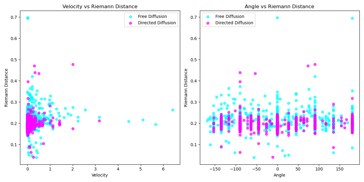
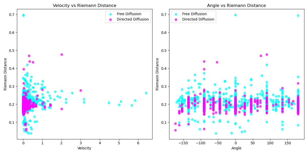
Continuing this investigation, we can create scatter plots to visualize the relationships between Riemann velocities and angles, as well as between Riemann velocities and distances. These plots (Figure 19, Figure 20) illustrate that in the directed migration mode, the scatter of Riemann distances is more concentrated, showing less variability in the Directed Migration mode.

Code
def plot_velocity_riemann_and_angle_riemann_for_two_modes():
    type_data = defaultdict(lambda: {'velocity': [], 'riemann': [], 'angle': []})
    colors = {2: "cyan", 3: "magenta"}
    labels = {2: "Free Diffusion", 3: "Directed Diffusion"}
    with h5py.File('time_events_95.h5', 'r') as f:
        for plot_index in range(total_plots):
            track_i_data = f[f'/track_{plot_index+1}'][:]
            first_three_rows = track_i_data[:3]
            event_indices = first_three_rows[0, :].astype(int) - 1
            interval_types = first_three_rows[2, :]

            for start_idx, interval_type in enumerate(interval_types):
                if start_idx + 1 < len(event_indices) and interval_type in [2, 3]: 
                    start = event_indices[start_idx] + 1
                    end = event_indices[start_idx + 1]
                    type_key = int(interval_type)

                    for idx in range(start, end + 1):
                        velocity = get_abs_velocity(plot_index, idx)
                        riemann_distance = get_riemann_dist(plot_index, idx) / (get_times(plot_index, idx) - get_times(plot_index, idx - 1))
                        angle = get_velocity_angle_rel(plot_index, idx)

                        type_data[type_key]['velocity'].append(velocity)
                        type_data[type_key]['riemann'].append(riemann_distance)
                        type_data[type_key]['angle'].append(angle)

    plt.figure(figsize=(12, 6))

    plt.subplot(1, 2, 1)
    for mode in [2, 3]:  
        plt.scatter(
            type_data[mode]['velocity'],
            type_data[mode]['riemann'],
            color=colors[mode],
            label=labels[mode],
            alpha=0.7
        )
    plt.xlabel("Velocity")
    plt.ylabel("Riemann Distance")
    plt.title("Velocity vs Riemann Distance")
    plt.legend()

    plt.subplot(1, 2, 2)
    for mode in [2, 3]: 
        plt.scatter(
            type_data[mode]['angle'],
            type_data[mode]['riemann'],
            color=colors[mode],
            label=labels[mode],
            alpha=0.7
        )
    plt.xlabel("Angle")
    plt.ylabel("Riemann Distance")
    plt.title("Angle vs Riemann Distance")
    plt.legend()

    plt.tight_layout()
    plt.savefig("scatter_two_95.png")
    plt.show()
Figure 19: Confidence level 0.95.
Figure 20: Confidence level 0.95.

Conformal mapping

The conformal mapping is a mathematical transformation that preserves local angles and shapes while potentially altering the size. In this study, we apply conformal maps based on the minimization of area distortion to transform the cell shape into a disk. This transformation allows us to observe protrusions locally, relative to a reference shape obtained after applying the conformal map. The algorithm, as described and implemented in prior works (Hu, Zou, and Hua 2014).

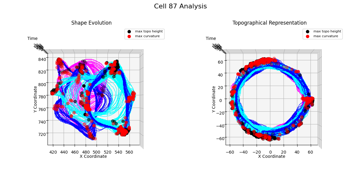
The example of topographical representation of a cell can be seen below {Figure 21}:

Figure 21: Cell Shape and Conformal Topographical Representation Over Time.

As discussed in the project proposal, during cell migration, the cytoskeleton undergoes changes that lead to the formation of protrusions on the cell membrane. These protrusions can be detected in two ways:

  1. Curvature Analysis: By computing the curvature of the cell shape and identifying its local extrema, which indicate significant deformations of cell shape.

  2. Conformal Mapping Analysis: By calculating the difference between the topological cell representation obtained after applying conformal mapping and identifying local maxima, which reveal the locations of protrusions.

Clement Soubrier adjusted the unwrap2D framework (Zhou et al. 2023) for our specific problem and developed the code to accumulate protrusion statistics using both methods. The results are presented below.

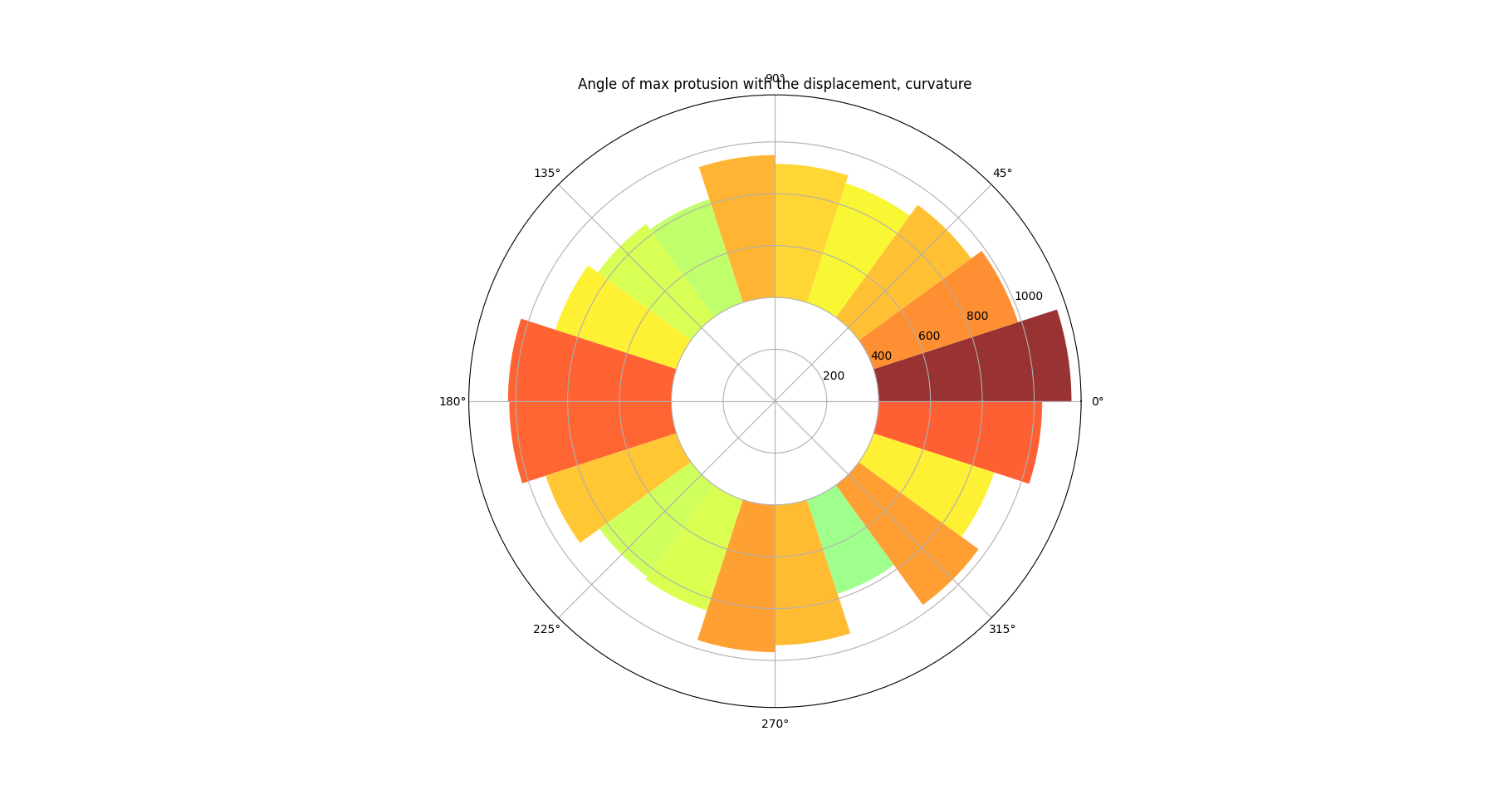
Figure 22: Curvature defined protrusion map
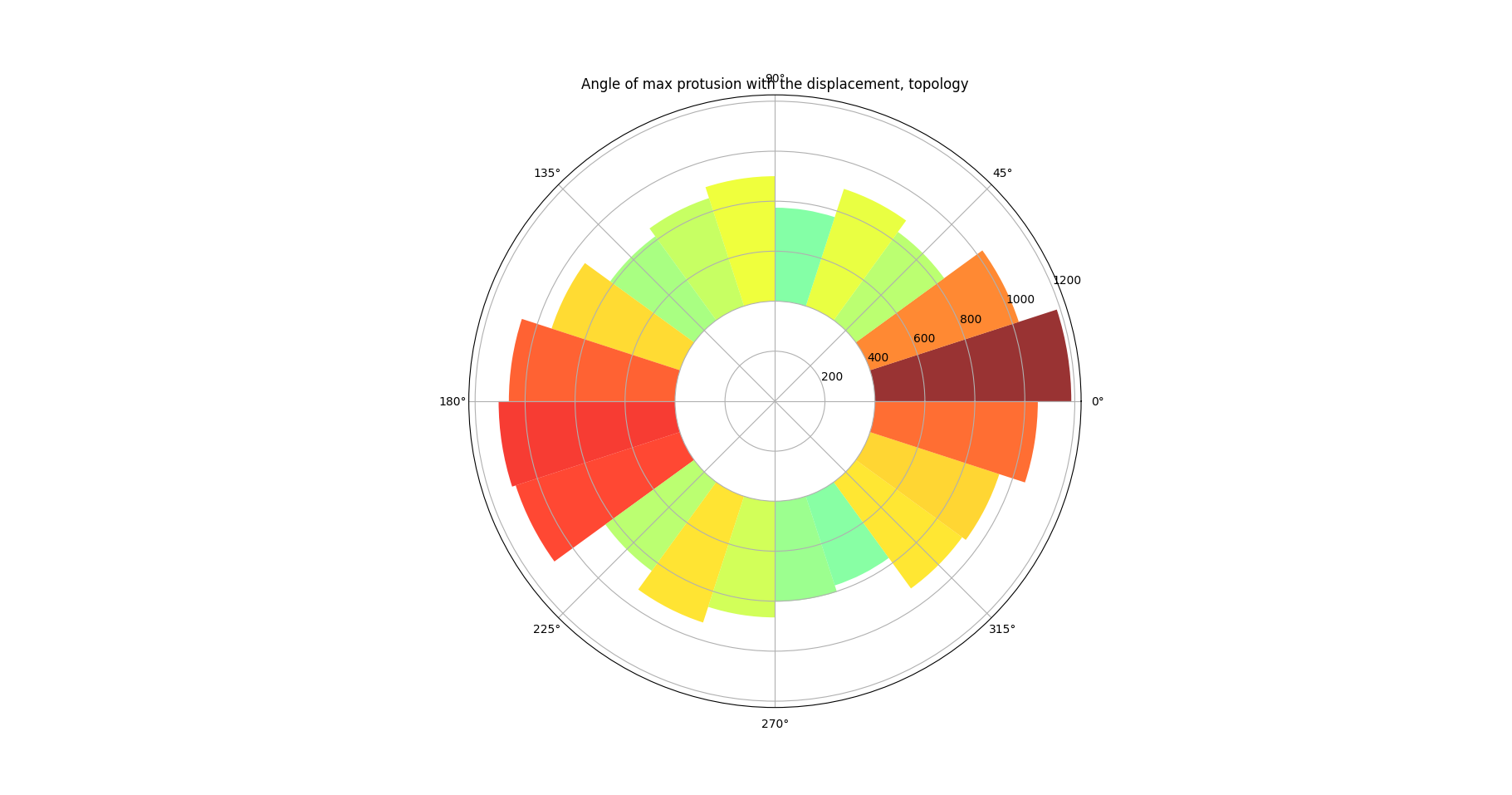
Figure 23: Topologically defined protrusion map

Figure 22 and Figure 23 demonstrate pie charts showing the difference between the protrusion direction and the direction of cell migration. These figures reveal that protrusions emerge at the front and rear of the cell, a behavior consistently observed in many experiments (SenGupta, Parent, and Bear 2021). Figure 22 additionally highlights that the protrusion region at the front of the cell is broader than at the rear, which may be associated with the formation of lamellipodia.

This section demonstrated how conformal mapping can be used to investigate cell shape dynamics. However, the analysis conducted here is not limited to the whole dataset examples. Future research could focus on more detailed single-cell analyses, exploring the interplay between protrusion dynamics and cell migration.

Additional examples of conformal mapping application to single cell analysis are provided in (Section 6.0.6).

Conclusion

In this project, we conducted an analysis of cell migration and shape dynamics processes. We examined cell trajectories over time, identifying migration modes and transitions between motility regimes using a segmentation and classification framework.

While we observed that Riemann velocities coincided with certain motion switch events, no consistent global correlation was found between Riemann velocity behavior and these transitions. This lack of correlation might be attributed to errors in cell segmentation. Repeating the experiment with a resegmented dataset might enhance accuracy.

Despite this, the accumulated statistical data of Riemann velocities highlights that cell shape variations depend significantly on the migration modes observed. Cell spatial velocities and directional angles also varied during transitions between migration modes.

Conformal mapping, a promising tool applied in this study, reaffirmed classical experimental results on direction of protrusion growth. However, at this stage, we have only minimally explored the use of conformal mapping for investigating specific artifacts of cell migration. In future, it would be valuable to focus on single-cell analysis identifying similar patterns of cell behavior, such as the formation of multiple large protrusions or uniform cell growth. Quantifying the protrusion analysis(counting them, locating, measuring size etc) would be promising as well.

Besides, our research opens the door for combining Riemann velocities analysis with conformal mapping tools. One may detect the protrusion events observed due to conformal mapping and align it with Riemann dynamics.

Thus, based on these conclusions, the following future plans are proposed:

Future plans

  1. Dataset expansion: increase the dataset size to observe more characteristic transitions between migration modes and obtain more data for the statistical analysis.

  2. Resegmentation: test the existing methods on a resegmented dataset.

  3. Improve single cell conformal analysis: looking for consistent cooperative protrusion patterns appear at different event, potentially protrusions distribution.

  4. Quantifying the protrusion: develop mathematical tools to describe properties of protrusive behavior, including size, quantity, and shape of individual protrusions.

  5. Testing another classifier: since the classifier we employ doesn’t take the superdiffusion mode into consideration, it might be useful to take another one. For example, DL-MSS might help (Arts et al. 2019) .

  6. Combine Riemann Velocity and Conformal Mapping tools: align Riemann velocity dynamics with protrusion patterns identified using conformal mapping. Moreover, looking at less motile cells may simplify the observation of protrusions.

Appendix

Dataset organization

To simplify the analysis, centroid and time data were organized into arrays.

Code
for cell_i in range(1,204):
    number_of_frames = sum(os.path.isdir(os.path.join(f"cells/cell_{cell_i}", entry)) for entry in os.listdir(f"cells/cell_{cell_i}"))  

    iter_distance = np.zeros(number_of_frames)
    iter_time = np.zeros(number_of_frames)
    iter_centroid = np.array([np.random.rand(2) for _ in range(number_of_frames)])
    for i in range(number_of_frames):
        iter_time[i] = np.load(f'cells/cell_{cell_i}/frame_{i+1}/time.npy')
        iter_centroid[i] = np.load(f'cells/cell_{cell_i}/frame_{i+1}/centroid.npy')
    riemann_distances.append(iter_distance)
    times.append(iter_time)
    centroids.append(iter_centroid)
data_path = ########
with open(data_path+"/times.npy", 'wb') as f:
    np.save(f, np.array(times, dtype=object))
with open(data_path+"/centroid.npy", 'wb') as f:
    np.save(f, np.array(centroids, dtype=object))

DC-MSS data preparation

Code
import numpy as np
from scipy.io import savemat
                                                                            
tracks = {}
for i, trajectory in enumerate(data):
    n_frames = trajectory.shape[0]
    row = np.zeros(n_frames * 8)  
    for j, (x, y) in enumerate(trajectory):
        start_idx = j * 8  
        row[start_idx] = x 
        row[start_idx + 1] = y  

    tracks[f"track_{i+1}"] = row  

output_path = "trajectory_data.mat"
savemat(output_path, {'tracks': tracks})

This piece of code converts trajectory data into a .mat file, compatible with MATLAB.

Alignment

The alignment function (kindly provided by Wanxin Li) ensures proper alignment of cell shapes:

Code
def align(point, base_point, rescale, rotation, reparameterization, k_sampling_points): #rotation set as False
    """
    Align point and base_point via quotienting out translation, rescaling, rotation and reparameterization
    """

    total_space = DiscreteCurvesStartingAtOrigin(k_sampling_points=k_sampling_points)
   
    
    # Quotient out translation 
    point = total_space.projection(point) 
    point = point - gs.mean(point, axis=0)

    base_point = total_space.projection(base_point)
    base_point = base_point - gs.mean(base_point, axis=0)

    # Quotient out rescaling
    if rescale:
        point = total_space.normalize(point) 
        base_point = total_space.normalize(base_point)
    
    # Quotient out rotation
    if rotation:
        point = rotation_align(point, base_point, k_sampling_points)

    # Quotient out reparameterization
    if reparameterization:
        aligner = DynamicProgrammingAligner(total_space)
        total_space.fiber_bundle = ReparametrizationBundle(total_space, aligner=aligner)
        point = total_space.fiber_bundle.align(point, base_point)
    return point

Plotting Riemann Velocities of time

Code
def plot_riemann_cell(plot_index):
    riemann_distances = []
    time_data = []
    
    num_frames = len(centr[plot_index-1])
    
    for frame in range(1, num_frames):

        dist_value = get_riemann_dist(plot_index-1, frame) / (get_times(plot_index-1, frame) - get_times(plot_index-1, frame - 1))
        riemann_distances.append(dist_value)
        time_data.append(get_times(plot_index-1, frame))

    plt.figure(figsize=(8,6))
    plt.plot(time_data, riemann_distances, marker='o', linestyle='-')
    plt.xlabel("Time")
    plt.ylabel("Riemann Velocities")
    plt.title(f"Cell {plot_index}")
    plt.grid(True)
    plt.show()

Riemann Velocities graph for cell №87

Plotting Riemann Distances with segmentation

Code
def riemann_single_cell_classification(cell_number):
    cell_index = cell_number - 1  


    riemann_distances = []
    time_data = []
    type_data = defaultdict(list)  

    with h5py.File('time_events_90.h5', 'r') as f:
        track_i_data = f[f'/track_{cell_index+1}'][:]
        first_three_rows = track_i_data[:3]
        event_indices = first_three_rows[0, :].astype(int) - 1  
        interval_types = first_three_rows[2, :]  # 

 
    time_data = [times[cell_index][idx] for idx in range(1, len(times[cell_index]))]  
    riemann_distances = [
        get_riemann_dist(cell_index, idx) / (get_times(cell_index, idx) - get_times(cell_index, idx - 1))
        for idx in range(1, len(times[cell_index]))
    ]

    interval_colors = {
        0: "brown",      
        1: "blue",       
        2: "cyan",       
        3: "magenta",    
        "unclassified": "black"  
    }


    fig, ax = plt.subplots(figsize=(8, 6))

    for start_idx, interval_type in enumerate(interval_types):
        start = event_indices[start_idx]
        end = event_indices[start_idx + 1] if start_idx + 1 < len(event_indices) else len(time_data) - 1

        if start < len(time_data) and end < len(time_data):
            time_segment = time_data[start:end + 1]  
            segment = riemann_distances[start:end + 1]

            interval_type = int(interval_type) if not np.isnan(interval_type) else "unclassified"
            color = interval_colors.get(interval_type, "black")

            type_data[interval_type].extend(segment)

            ax.plot(time_segment, segment, color=color)

    from matplotlib.lines import Line2D
    legend_elements = [
        Line2D([0], [0], color="brown", lw=2, label="Immobile"),
        Line2D([0], [0], color="blue", lw=2, label="Confined Diffusion"),
        Line2D([0], [0], color="cyan", lw=2, label="Free Diffusion"),
        Line2D([0], [0], color="magenta", lw=2, label="Directed Diffusion"),
        Line2D([0], [0], color="black", lw=2, label="Unclassified")
    ]
    ax.legend(handles=legend_elements, loc="upper right", fontsize=8)

    ax.set_xlabel("Time")
    ax.set_ylabel("Riemann velocity")
    ax.set_title(f"Cell {cell_number}", fontsize=10)
    ax.tick_params(axis='both', which='major', labelsize=8)

    plt.tight_layout()
    plt.savefig(f"riemann_single_cell_{cell_number}_classification_90.png")
    plt.show()

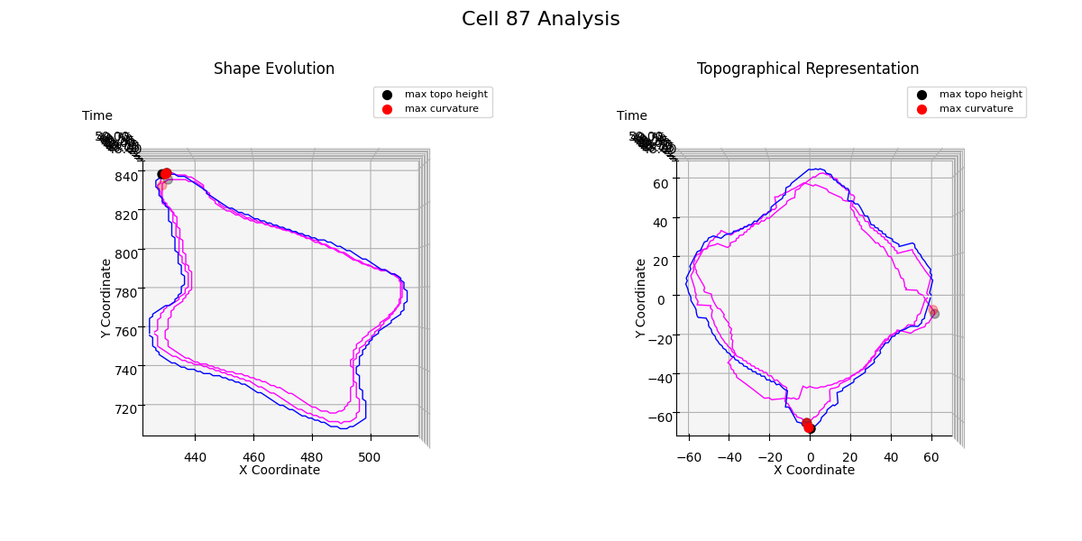
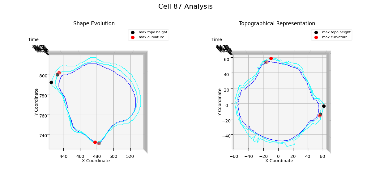
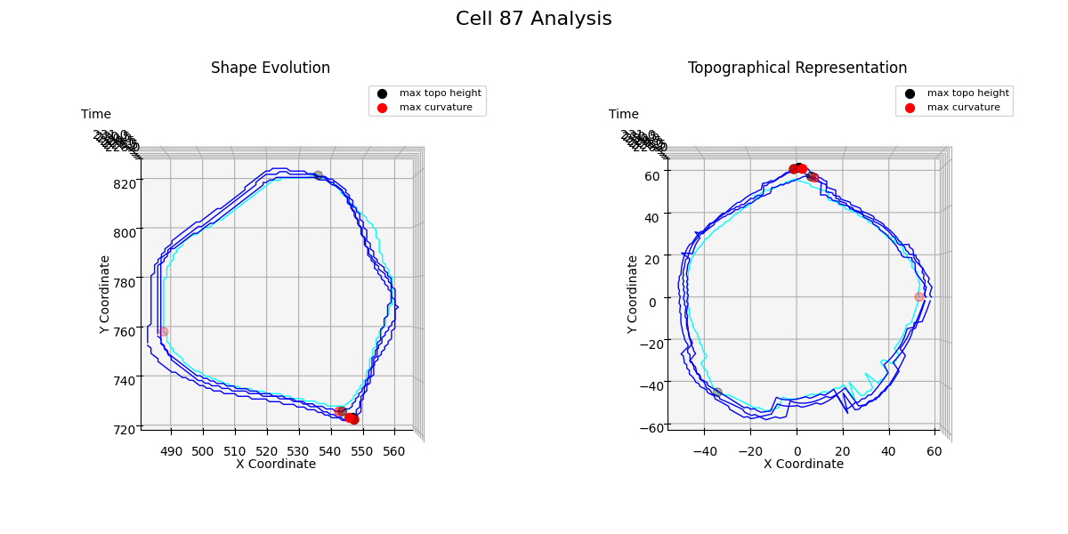
Additional examples: cell №87 topographical representations over migration modes transitions

This section doesn’t include any sufficient results to report in the blog, but there we tried to collect some evidence of a single cell shape artifacts which emerge during migration modes transitions.

Figure 24: t = 51

From the Figure 24, we observe that when the cell transitions from directed migration to a free or confined diffusion mode, a new noticeable protrusion is formed, and the overall structure of the cell membrane undergoes significant multilateral changes.

Figure 25: t = 85

Figure 25 shows how the cell increases its volume almost uniformly across the entire membrane curve.

Figure 26: t = 230

Topological analysis Figure 26 reveals how the cell transforms two protrusions into a single one while decreasing its volume.

Since these conclusions are superficial and far-fetched, the farther exploration of single-cell topological representations might lead to a significant advance of this research.

References

Arts, Marloes, Ihor Smal, Maarten W. Paul, Claire Wyman, and Erik Meijering. 2019. “Particle Mobility Analysis Using Deep Learning and the Moment Scaling Spectrum.” Nature News. Nature Publishing Group. https://www.nature.com/articles/s41598-019-53663-8.
Dieterich, Peter, Rainer Klages, Roland Preuss, and Albrecht Schwab. 2008. “Anomalous Dynamics of Cell Migration.” Proceedings of the National Academy of Sciences 105 (2): 459–63. https://doi.org/10.1073/pnas.0707603105.
Hu, Jiaxi, Guangyu Jeff Zou, and Jing Hua. 2014. “Volume-Preserving Mapping and Registration for Collective Data Visualization.” IEEE Transactions on Visualization and Computer Graphics 20 (12): 2664–73. https://doi.org/10.1109/tvcg.2014.2346457.
Kapanidis, Achillefs, Stephan Uphoff, and Mathew Stracy. 2018. “Understanding Protein Mobility in Bacteria by Tracking Single Molecules.” Journal of Molecular Biology 430 (May). https://doi.org/10.1016/j.jmb.2018.05.002.
Li, Wanxin, Ashok Prasad, Nina Miolane, and Khanh Dao Duc. 2023. “Using a Riemannian Elastic Metric for Statistical Analysis of Tumor Cell Shape Heterogeneity.” In Geometric Science of Information, edited by Frank Nielsen and Frédéric Barbaresco, 583–92. Cham: Springer Nature Switzerland.
Rosen, Christopher P. AND Dallon, Mary Ellen AND Grant. 2021. “Mean Square Displacement for a Discrete Centroid Model of Cell Motion.” PLOS ONE 16 (12): 1–19. https://doi.org/10.1371/journal.pone.0261021.
SenGupta, Shuvasree, Carole A. Parent, and James E. Bear. 2021. “The Principles of Directed Cell Migration.” Nature Reviews Molecular Cell Biology 22 (8): 529–47. https://doi.org/10.1038/s41580-021-00366-6.
Vega, Anthony R., Spencer A. Freeman, Sergio Grinstein, and Khuloud Jaqaman. 2018. “Multistep Track Segmentation and Motion Classification for Transient Mobility Analysis.” Biophysical Journal 114 (5): 1018–25. https://doi.org/https://doi.org/10.1016/j.bpj.2018.01.012.
Wikipedia. n.d. “Anomalous Diffusion.” https://en.wikipedia.org/wiki/Anomalous_diffusion.
Zhou, Felix Y., Andrew Weems, Gabriel M. Gihana, Bingying Chen, Bo-Jui Chang, Meghan Driscoll, and Gaudenz Danuser. 2023. “Surface-Guided Computing to Analyze Subcellular Morphology and Membrane-Associated Signals in 3D.” bioRxiv. https://doi.org/10.1101/2023.04.12.536640.