import sys
from pathlib import Path
from decimal import Decimal
import matplotlib.pyplot as plt

sys.path=['', '/opt/petsc/linux-c-opt/lib', '/home/uki', '/usr/lib/python312.zip', '/usr/lib/python3.12', '/usr/lib/python3.12/lib-dynload', '/home/uki/Desktop/blog/posts/CC-cells/.venv/lib/python3.12/site-packages']

import numpy as np
import seaborn as sns
import squidpy as sqIntroduction
Capsular contracture (CC) is an ailing complication that arises commonly amonst breast cancer patients after reconstructive breast implant surgery. CC patients suffer from aesthetic deformation, pain, and in rare cases, they may develop anaplastic large cell lymphoma (ALCL), a type of cancer of the immune system. The mechanism of CC is unknown, and there are few objective assessments of CC based on histology.
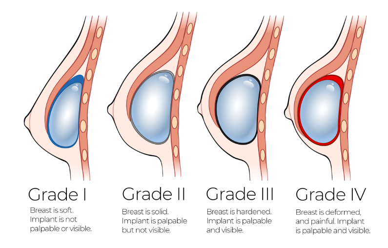
Baker grade is a subjective, clinical evaluation for the extent of CC (See Fig 1). Many researchers have measured histological properties in CC tissue samples, and correlated theses findings to their assigned Baker grade. It has been found that a high density of immune cells is associated with higher Baker grade.
These immune cells include fibroblasts and myofibroblasts, which can distort surrounding tissues by contracting and pulling on them. The transition from the fibroblast to myofibroblast phenotype is an important driving step in many fibrotic processes including capsular contracture. In wound healing processes, the contactility of myofibroblasts is essential in facilitating tissue remodelling, however, an exess amount of contratile forces creates a positive feedback loop of enhanced immune cell recruitment, leading to the formation of pathological capsules with high density and extent of deformation.
Myofibroblasts, considered as an “activated” form of fibroblasts, is identified by the expression of alpha-smooth muscle actin (\(\alpha\)-SMA). However, this binary classification system does not capture the full range of complexities involved in the transition between these two phenotypes. Therefore, it is beneficial to develop a finer classification system of myofibroblasts to explain various levels of forces they can generate. One recent work uses pre-defined morphological features of cells, including perimeter and circularity, to create a continuous spectrum of myofibroblast activation (Hillsley et al. 2022).
Research suggests that mechanical strain induces change in cell morphology, inducing round cells that are lacking in stress fibers into more broad, elongated shapes. We hypothesize that cell shapes influence their ability to generate forces via mechanisms of cell-matrix adheshion and cell traction. Further, we hypothesis that cell shape is directly correlated with the severity of CC by increasing contractile forces.
In order to test these hypothesis, we will take a 2-step approach. The first step involves statistical analysis on correlation between cell shapes and their associated Baker grade. To do this, we collect cell images from CC samples with various Baker grades, using Geomstat we can compute a characteristic mean cell shape for each sample. Then, we cluster these characteristic cell shapes into 4 groups, and observe the extent of overlap between this classification and the Baker grade. We choose the elastic metric, associated with its geodesic distances, since it allows us to not only looking at classification, but also how cell shape deforms. If we can find a correlation, the second step is then to go back to in-vitro studies of fibroblasts, and answer the question: can the shapes of cells predict their disposition to developing into a highly contractile phenotype (linked to more severe CC)? I don’t have a concrete plan for this second step yet, however, it motivates this project as it may suggest a way to predict clinical outcomes based on pre-operative patient assessment.
Cell Segmentation
I was provided with histological images of CC tissues, by a group in Coppenhagen {add credit and citations}. The images are \(\alpha\)-SMA stained to visualize myofibroblasts, each image is associated with a Baker Grade and the age of the implant. The first step is to preprocess the images and segment the cells. After some attempts with different segmentation algorithms, I opted to use a custom segmentation model with squidpy.
Example workflow
For each image, we go through the following process for cell segmentation.
filename = '/home/uki/Desktop/blog/posts/CC-cells/images/low/7-1.tif'
img = sq.im.ImageContainer(filename)

# smooth image
sq.im.process(img, layer="image", method="smooth", sigma=0) #sigma value depends on the quality of each image, needs to be manually adjusted

# plot the result
fig, axes = plt.subplots(1, 2)
for layer, ax in zip(["image", "image_smooth"], axes):
    img.show(layer, ax=ax)
    ax.set_title(layer)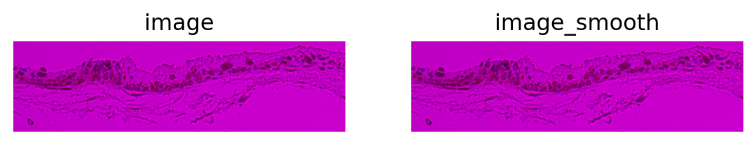
fig, axes = plt.subplots(1, 3, figsize=(15, 4))
img.show("image_smooth", cmap="gray", ax=axes[0])
axes[1].imshow(img["image_smooth"][:, :, 0, 0] < 110)  # in this case, setting the threshold at 110 gives us reasonable results
_ = sns.histplot(np.array(img["image_smooth"]).flatten(), bins=50, ax=axes[2])
plt.tight_layout()

plt.show() #Second images are smoothed, then flattened, then histogram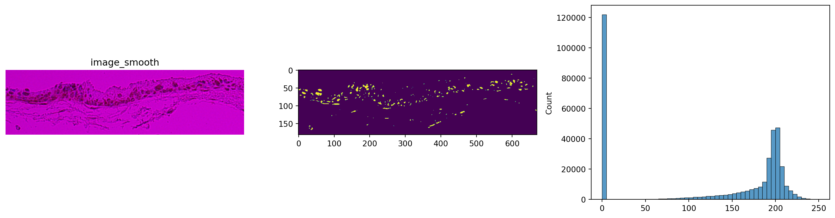
sq.im.segment(img=img, layer="image_smooth", method="watershed", thresh=110, geq=False)
# NOTE: This thresh must be adjusted per image analyzed based on histogramprint(img)
print(f"Number of segments in crop: {len(np.unique(img['segmented_watershed']))}")
fig, axes = plt.subplots(1, 2)
img.show("image", channel=0, ax=axes[0])
_ = axes[0].set_title("H&E")
img.show("segmented_watershed", cmap="jet", interpolation="none", ax=axes[1])
_ = axes[1].set_title("segmentation")ImageContainer[shape=(182, 670), layers=['image', 'image_smooth', 'segmented_watershed']]
Number of segments in crop: 281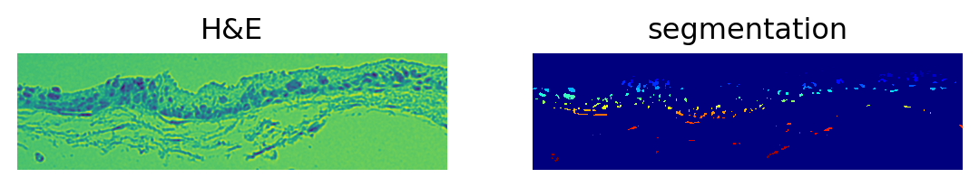
Some data wrangling
We get a lot of cells from the segmented image. Unfortunately, the segmentation results are not immediately usable for our purposes, so I write an inelegenat script to find the identified cell borders. In this process we get rid of a large portion of segmentations that are unusable.
my_array = img["segmented_watershed"].data #plain numpy array of cellseg data
my_array = my_array.squeeze()
my_rows, my_cols = my_array.shape
mark_for_deletion = np.zeros((my_rows,my_cols),dtype=np.int8)

#intentionally omit boundaries
for x in range(1,my_cols-1):
  for y in range(1,my_rows-1):
    val = my_array[y,x]
    if val == 0: #Not a cell so no processing required
      continue
    #Not zero so this pixel is a cell
    #Mark for deletion if all cardinal neighbors are part of the same cell
    if my_array[y-1,x] != val:
      continue
    if my_array[y+1,x] != val:
      continue
    if my_array[y,x-1] != val:
      continue
    if my_array[y,x+1] != val:
      continue
    mark_for_deletion[y,x] = 1

for x in range(1,my_cols-1):
  for y in range(1,my_rows-1):
    if mark_for_deletion[y,x] == 1:
      my_array[y,x] = 0

plt.imshow(my_array,interpolation='none')
plt.show() #Third image shown is the borders I derived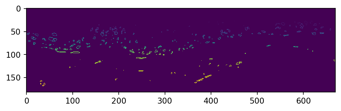
Some more work is required to find 2D coordinates resulting from this, we take away borders with too few data points to work with. This step runs quite slow at the moment and could be optimized.
my_cell_borders = []

for val in np.unique(my_array):
    temp_array = []
    if val == 0:
        continue
    for x in range(0,my_cols):
        for y in range(0,my_rows):
            if my_array[y,x] == val:
                temp_array.append(np.array([y,x]))
    if len(temp_array)>9:
        my_cell_borders.append(np.array(temp_array))
We repeat this process for several images, due to the inconsistencies in the qualities of our obtained images, special image processing steps had to be designed for each image and implemented manually. These steps are omitted here, eventually we obtain 2 separate lists of 2D cell coordinates, for low grade (Baker I&II) and high grade (Baker III&IV) samples respectively.
import pickle

with open('low-grade.pkl', 'rb') as fp:
    low_grade_cells = pickle.load(fp)

with open ('high-grade.pkl', 'rb') as fp:
    high_grade_cells = pickle.load(fp)

cells = low_grade_cells + high_grade_cells

print(f"Total number of cells : {len(low_grade_cells)+len(high_grade_cells)}")
Total number of cells : 295Pre-Processing
Sort labelling data
Since the data is unordered, we need to sort the coordinates in order to visualize cell shapes.
def sort_coordinates(list_of_xy_coords):
    cx, cy = list_of_xy_coords.mean(0)
    x, y = list_of_xy_coords.T
    angles = np.arctan2(x-cx, y-cy)
    indices = np.argsort(angles)
    return list_of_xy_coords[indices]
sorted_cells = []
for cell in cells:
sorted_cells.append(sort_coordinates(cell))index = 2
cell_rand = cells[index]
cell_sorted = sorted_cells[index]
fig = plt.figure(figsize=(15, 5))
fig.add_subplot(121)
plt.scatter(cell_rand[:, 0], cell_rand[:, 1], color='black', s=4)
plt.plot(cell_rand[:, 0], cell_rand[:, 1])
plt.axis("equal")
plt.title(f"Original coordinates")
plt.axis("off")
fig.add_subplot(122)
plt.scatter(cell_sorted[:, 0], cell_sorted[:, 1], color='black', s=4)
plt.plot(cell_sorted[:, 0], cell_sorted[:, 1])
plt.axis("equal")
plt.title(f"sorted coordinates")
plt.axis("off")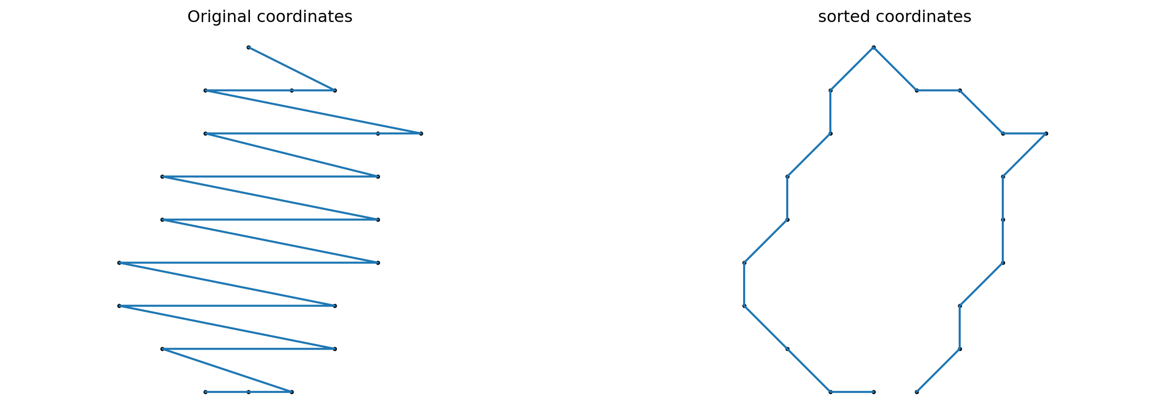
Interpolation and removing duplicate sample points
import geomstats.backend as gs
from common import *
import random
import os
import scipy.stats as stats
from sklearn import manifold

gs.random.seed(2024)
def interpolate(curve, nb_points):
"""Interpolate a discrete curve with nb_points from a discrete curve.
Returns
-------
interpolation : discrete curve with nb_points points
"""
old_length = curve.shape[0]
interpolation = gs.zeros((nb_points, 2))
incr = old_length / nb_points
pos = 0
for i in range(nb_points):
index = int(gs.floor(pos))
interpolation[i] = curve[index] + (pos - index) * (
curve[(index + 1) % old_length] - curve[index]
)
pos += incr
return interpolation
k_sampling_points = 500index = 2
cell_rand = sorted_cells[index]
cell_interpolation = interpolate(cell_rand, k_sampling_points)
fig = plt.figure(figsize=(15, 5))
fig.add_subplot(121)
plt.scatter(cell_rand[:, 0], cell_rand[:, 1], color='black', s=4)
plt.plot(cell_rand[:, 0], cell_rand[:, 1])
plt.axis("equal")
plt.title(f"Original curve ({len(cell_rand)} points)")
plt.axis("off")
fig.add_subplot(122)
plt.scatter(cell_interpolation[:, 0], cell_interpolation[:, 1], color='black', s=4)
plt.plot(cell_interpolation[:, 0], cell_interpolation[:, 1])
plt.axis("equal")
plt.title(f"Interpolated curve ({k_sampling_points} points)")
plt.axis("off")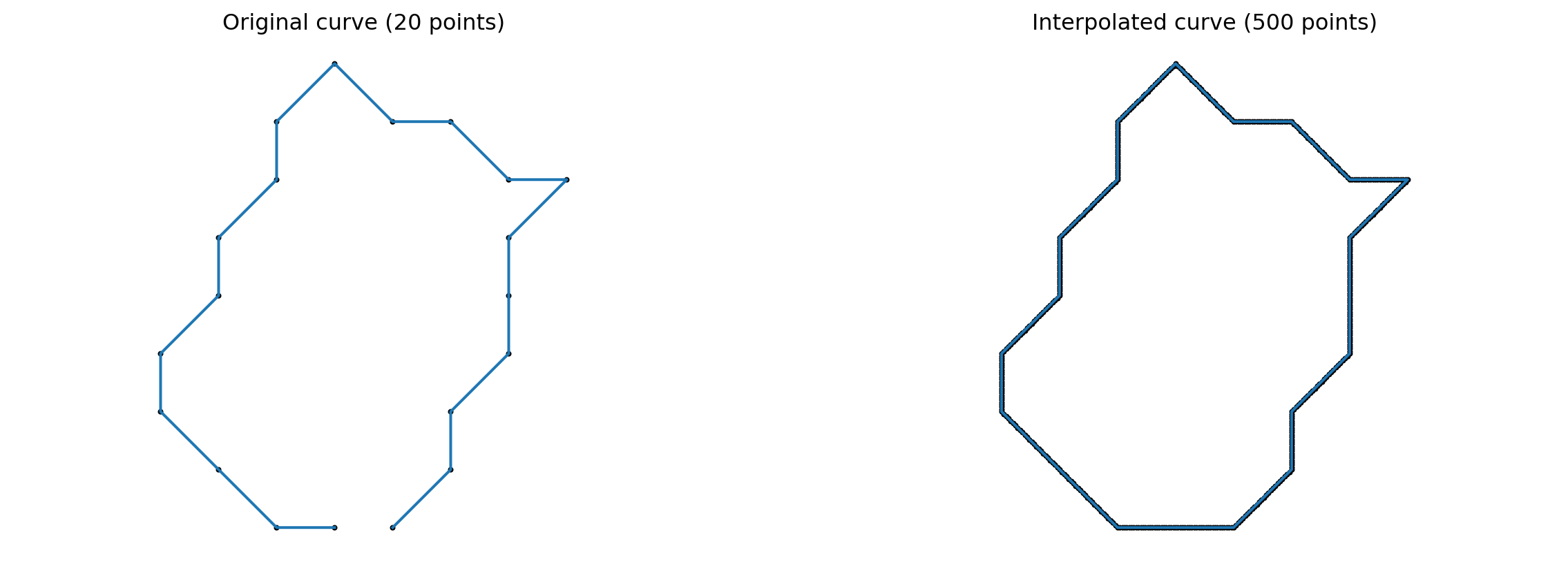
def preprocess(curve, tol=1e-10):
    """Preprocess curve to ensure that there are no consecutive duplicate points.
    Returns
    -------
    curve : discrete curve
    """

    dist = curve[1:] - curve[:-1]
    dist_norm = np.sqrt(np.sum(np.square(dist), axis=1))

    if np.any( dist_norm < tol ):
        for i in range(len(curve)-1):
            if np.sqrt(np.sum(np.square(curve[i+1] - curve[i]), axis=0)) < tol:
                curve[i+1] = (curve[i] + curve[i+2]) / 2

    return curve
interpolated_cells = []
for cell in sorted_cells:
interpolated_cells.append(preprocess(interpolate(cell, k_sampling_points)))Alignment
from geomstats.geometry.pre_shape import PreShapeSpace

AMBIENT_DIM = 2

PRESHAPE_SPACE = PreShapeSpace(ambient_dim=AMBIENT_DIM, k_landmarks=k_sampling_points)

PRESHAPE_SPACE.equip_with_group_action("rotations")
PRESHAPE_SPACE.equip_with_quotient()


def exhaustive_align(curve, base_curve):
    """Align curve to base_curve to minimize the L² distance.

    Returns
    -------
    aligned_curve : discrete curve
    """
    nb_sampling = len(curve)
    distances = gs.zeros(nb_sampling)
    base_curve = gs.array(base_curve)
    for shift in range(nb_sampling):
        reparametrized = [curve[(i + shift) % nb_sampling] for i in range(nb_sampling)]
        aligned = PRESHAPE_SPACE.fiber_bundle.align(
            point=gs.array(reparametrized), base_point=base_curve
        )
        distances[shift] = PRESHAPE_SPACE.embedding_space.metric.norm(
            gs.array(aligned) - gs.array(base_curve)
        )
    shift_min = gs.argmin(distances)
    reparametrized_min = [
        curve[(i + shift_min) % nb_sampling] for i in range(nb_sampling)
    ]
    aligned_curve = PRESHAPE_SPACE.fiber_bundle.align(
        point=gs.array(reparametrized_min), base_point=base_curve
    )
    return aligned_curve
aligned_cells = []
BASE_CURVE = interpolated_cells[0]
for cell in interpolated_cells:
aligned_cells.append(exhaustive_align(cell, BASE_CURVE))index = 1
unaligned_cell = interpolated_cells[index]
aligned_cell = exhaustive_align(unaligned_cell, BASE_CURVE)
fig = plt.figure(figsize=(15, 5))
fig.add_subplot(131)
plt.plot(BASE_CURVE[:, 0], BASE_CURVE[:, 1])
plt.plot(BASE_CURVE[0, 0], BASE_CURVE[0, 1], "ro")
plt.axis("equal")
plt.title("Reference curve")
fig.add_subplot(132)
plt.plot(unaligned_cell[:, 0], unaligned_cell[:, 1])
plt.plot(unaligned_cell[0, 0], unaligned_cell[0, 1], "ro")
plt.axis("equal")
plt.title("Unaligned curve")
fig.add_subplot(133)
plt.plot(aligned_cell[:, 0], aligned_cell[:, 1])
plt.plot(aligned_cell[0, 0], aligned_cell[0, 1], "ro")
plt.axis("equal")
plt.title("Aligned curve")Text(0.5, 1.0, 'Aligned curve')
Data Analysis
Computing mean cell shapes
It is not particularly meaningful to compute a global mean cell shape, but here we may generate some reference data and some simple, reproducible steps for more in-depth analysis.
from geomstats.geometry.discrete_curves import DiscreteCurvesStartingAtOrigin
from geomstats.learning.frechet_mean import FrechetMean

CURVES_SPACE_SRV = DiscreteCurvesStartingAtOrigin(ambient_dim=2, k_sampling_points=k_sampling_points)

mean = FrechetMean(CURVES_SPACE_SRV)

cell_shapes_at_origin = CURVES_SPACE_SRV.projection(gs.array(aligned_cells))
mean.fit(cell_shapes_at_origin[:500])

mean_estimate = mean.estimate_

plt.plot(mean_estimate[:, 0], mean_estimate[:, 1], "black");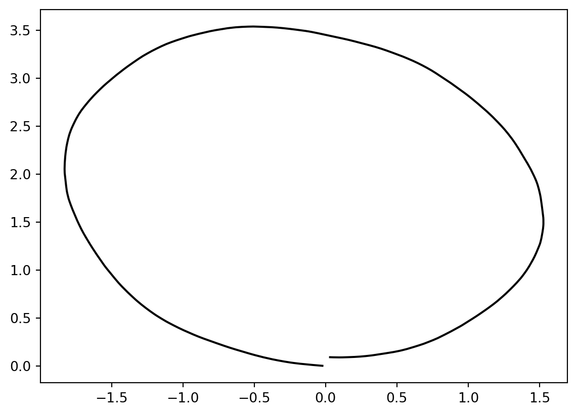
print(gs.sum(gs.isnan(mean_estimate)))
mean_estimate_clean = mean_estimate[~gs.isnan(gs.sum(mean_estimate, axis=1)), :]
print(mean_estimate_clean.shape)
mean_estimate_clean = interpolate(mean_estimate_clean, k_sampling_points - 1)
print(gs.sum(gs.isnan(mean_estimate_clean)))
print(mean_estimate_clean.shape)

print(cell_shapes_at_origin.shape)
for cell_at_origin in cell_shapes_at_origin:
    plt.plot(cell_at_origin[:, 0], cell_at_origin[:, 1], "lightgrey", alpha=0.2)

plt.plot(
    mean_estimate_clean[:, 0], mean_estimate_clean[:, 1], "black", label="Mean cell"
)
plt.legend(fontsize=12);
0
(499, 2)
0
(499, 2)
(295, 499, 2)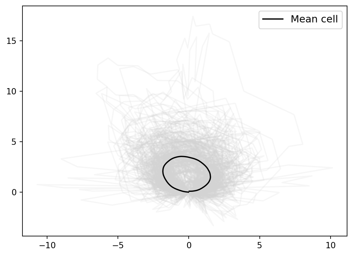
We adjust the scaling manually.
mean_estimate_aligned = 1.8 * mean_estimate_clean

for cell_at_origin in cell_shapes_at_origin:
    plt.plot(cell_at_origin[:, 0], cell_at_origin[:, 1], "lightgrey", alpha=0.2)

plt.plot(
    mean_estimate_aligned[:, 0], mean_estimate_aligned[:, 1], "black", label="Mean cell"
)
plt.legend(fontsize=12);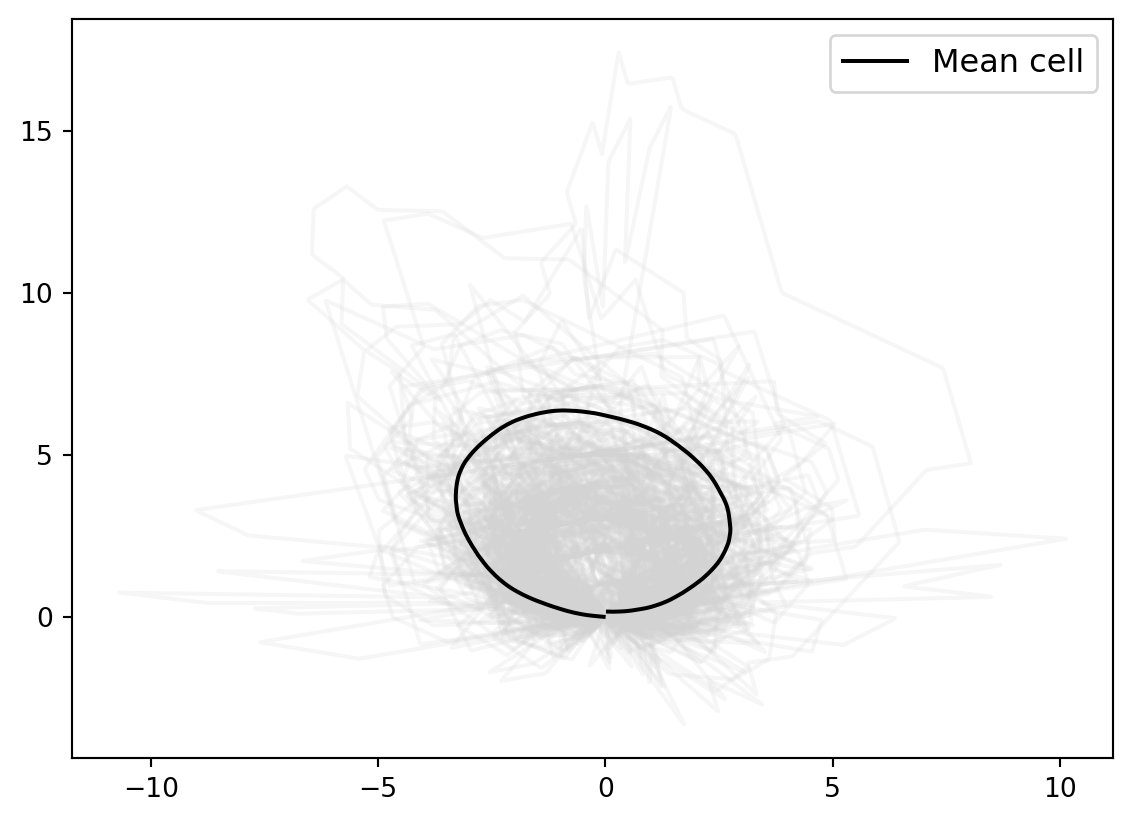
We compute the distance from each cell to the global mean cell shape, and plot the results on a histogram. It’s seen here that the majority of cells are close to the global mean.
dists_to_global_mean_list = []
for cell in aligned_cells:
    dists_to_global_mean_list.append(CURVES_SPACE_SRV.metric.dist(CURVES_SPACE_SRV.projection(cell), mean_estimate_aligned))
min_dists = min(dists_to_global_mean_list)
max_dists = max(dists_to_global_mean_list)
print(min_dists, max_dists)
xx = gs.linspace(gs.floor(min_dists), gs.ceil(max_dists), 100)1.4633405312629748 8.794301541946876from scipy import stats
fig, axs = plt.subplots(1, sharex=True, sharey=True, tight_layout=True, figsize=(8, 4))
for i in enumerate(aligned_cells):
distances = dists_to_global_mean_list
axs.hist(distances, bins=10, alpha=0.4, density=True)
kde = stats.gaussian_kde(distances)
axs.plot(xx, kde(xx))
axs.set_xlim((min_dists, max_dists))
axs.set_ylabel("Fraction of cells", fontsize=14)
fig.suptitle(
"Histograms of srv distances (a=1, b=0.5) to global mean cell", fontsize=20
)Text(0.5, 0.98, 'Histograms of srv distances (a=1, b=0.5) to global mean cell')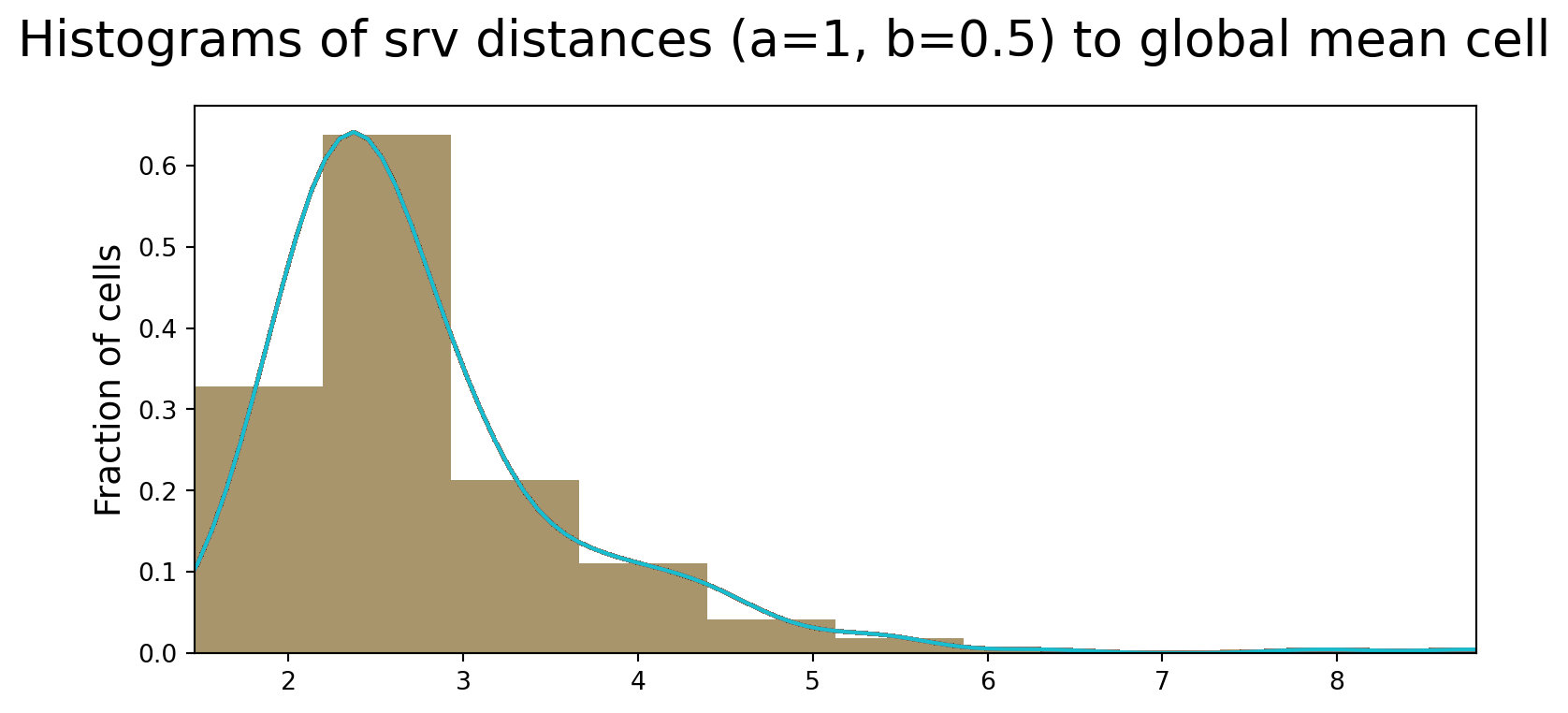
Differences between low and high grade cells
Now, we attempt to characterize geometric differences between cells from low vs. high grade CC samples. Perhaps as expected, we see a more rounded shape for low grade cells, and a more long, spindle shape for high grade cells.
low = aligned_cells[0:167]
high = aligned_cells[168:len(aligned_cells)]

low_shapes = CURVES_SPACE_SRV.projection(gs.array(low))
mean.fit(low_shapes[:500])
mean_estimate_low = mean.estimate_

high_shapes = CURVES_SPACE_SRV.projection(gs.array(high))
mean.fit(high_shapes[:500])
mean_estimate_high = mean.estimate_

fig = plt.figure(figsize=(15, 5))

fig.add_subplot(121)
plt.plot(mean_estimate_low[:, 0], mean_estimate_low[:, 1], "black");
plt.axis("equal")
plt.title(f"Low Grade Cells")
plt.axis("off")

fig.add_subplot(122)
plt.plot(mean_estimate[:, 0], mean_estimate_high[:, 1], "black");
plt.axis("equal")
plt.title(f"High Grade Cells")
plt.axis("off")
(-1.9972225059184727,
1.6950423762408362,
-0.177643622871598,
3.8498647025428094)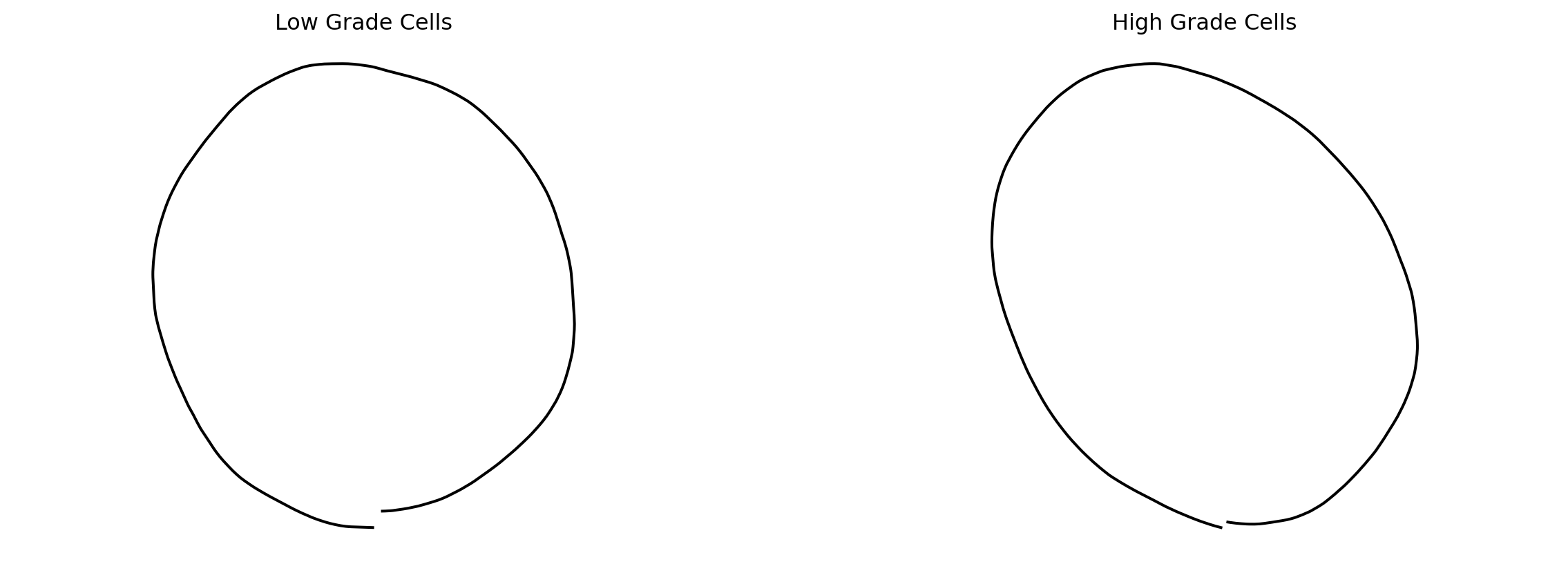
mean_estimate_clean_low = mean_estimate_low[~gs.isnan(gs.sum(mean_estimate_low, axis=1)), :]
mean_estimate_clean_low = interpolate(mean_estimate_clean_low, k_sampling_points - 1)

mean_estimate_clean_high = mean_estimate_high[~gs.isnan(gs.sum(mean_estimate_high, axis=1)), :]
mean_estimate_clean_high = interpolate(mean_estimate_clean_high, k_sampling_points - 1)

fig = plt.figure(figsize=(15, 5))

fig.add_subplot(121)
for cell_at_origin in low_shapes:
    plt.plot(cell_at_origin[:, 0], cell_at_origin[:, 1], "lightgrey", alpha=0.2)
plt.plot(
    mean_estimate_clean_low[:, 0], mean_estimate_clean_low[:, 1], "black", label="Mean cell shape for low grades"
)
plt.title(f"Low Grade Cells")

fig.add_subplot(122)
for cell_at_origin in high_shapes:
    plt.plot(cell_at_origin[:, 0], cell_at_origin[:, 1], "lightgrey", alpha=0.2)
plt.plot(
    mean_estimate_clean_high[:, 0], mean_estimate_clean_high[:, 1], "black", label="Mean cell shape for high grades"
)
plt.title(f"High Grade Cells")
Text(0.5, 1.0, 'High Grade Cells')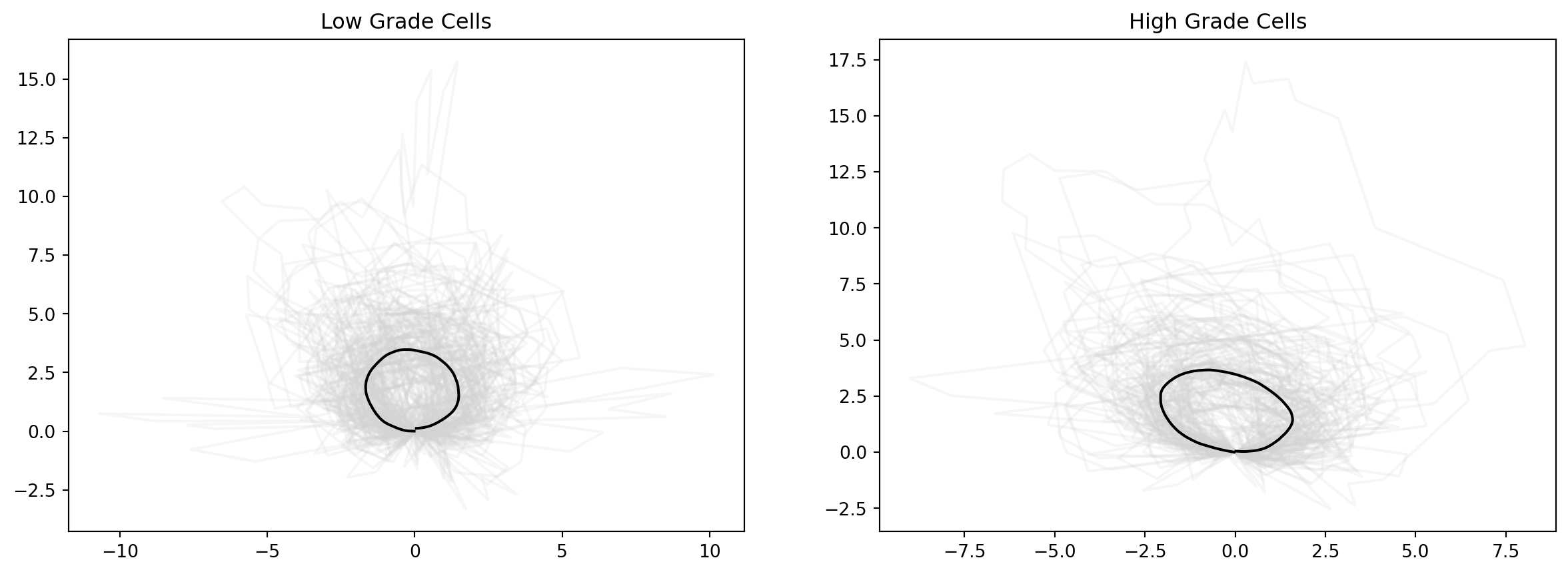
mean_estimate_aligned_low = 1.8 * mean_estimate_clean_low
mean_estimate_aligned_high = 1.6 * mean_estimate_clean_high

fig = plt.figure(figsize=(15, 5))

fig.add_subplot(121)
for cell_at_origin in low_shapes:
    plt.plot(cell_at_origin[:, 0], cell_at_origin[:, 1], "lightgrey", alpha=0.2)
plt.plot(
    mean_estimate_aligned_low[:, 0], mean_estimate_aligned_low[:, 1], "black", label="Mean cell shape for low grades"
)
plt.title(f"Low Grade Cells")

fig.add_subplot(122)
for cell_at_origin in high_shapes:
    plt.plot(cell_at_origin[:, 0], cell_at_origin[:, 1], "lightgrey", alpha=0.2)
plt.plot(
    mean_estimate_aligned_high[:, 0], mean_estimate_aligned_high[:, 1], "black", label="Mean cell shape for high grades"
)
plt.title(f"High Grade Cells")
Text(0.5, 1.0, 'High Grade Cells')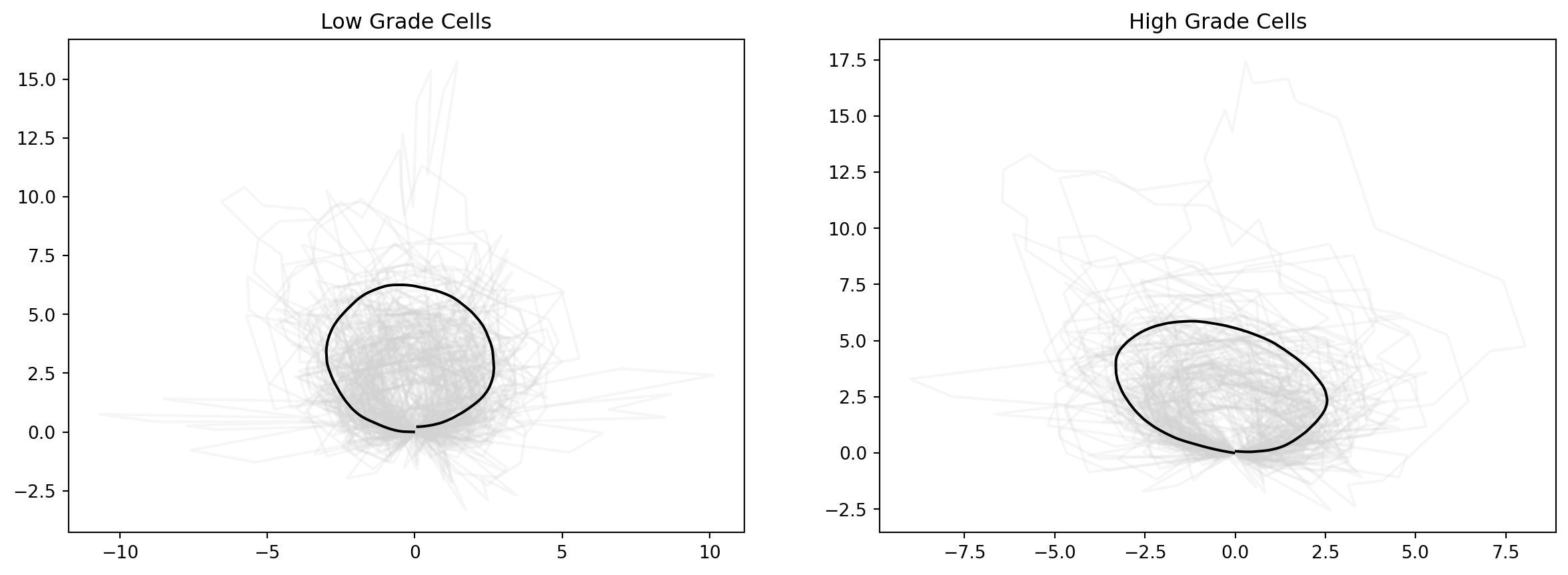
Below are the setup to visualizing distances with respect to each mean shape, due to time constraints this was not implemented.
dists_to_mean_low = []

for cell in low_shapes:
    dist_to_low = CURVES_SPACE_SRV.metric.dist(cell, mean_estimate_aligned_low)
    dist_to_high = CURVES_SPACE_SRV.metric.dist(cell, mean_estimate_aligned_high)
    dists_to_mean_low.append(np.array([dist_to_low, dist_to_high]))

dists_to_mean_high = []

for cell in high_shapes:
    dist_to_low = CURVES_SPACE_SRV.metric.dist(cell, mean_estimate_aligned_low)
    dist_to_high = CURVES_SPACE_SRV.metric.dist(cell, mean_estimate_aligned_high)
    dists_to_mean_high.append(np.array([dist_to_low, dist_to_high]))
dists = dists_to_mean_low + dists_to_mean_high
min_dists = np.min(dists)
max_dists = np.max(dists)
print(min_dists, max_dists)
xx = gs.linspace(gs.floor(min_dists), gs.ceil(max_dists), 100)1.3595235583661602 8.828945361746527Testing
Using a new set of images, we test the accuracy of this classification, we test on 11 cells from low Baker grade samples and 6 cells from high Baker grade samples.
with open('test-low-grade.pkl', 'rb') as fp:
    test_low_grade_cells = pickle.load(fp)

with open ('test-high-grade.pkl', 'rb') as fp:
    test_high_grade_cells = pickle.load(fp)
test_cells_aligned_low = []
test_cells_aligned_high = []
for cell in test_low_grade_cells:
cell_sorted = sort_coordinates(cell)
cell_interpolated = preprocess(interpolate(cell_sorted, k_sampling_points))
cell_aligned = exhaustive_align(cell_interpolated, BASE_CURVE)
test_cells_aligned_low.append(cell_aligned)
for cell in test_high_grade_cells:
cell_sorted = sort_coordinates(cell)
cell_interpolated = preprocess(interpolate(cell_sorted, k_sampling_points))
cell_aligned = exhaustive_align(cell_interpolated, BASE_CURVE)
test_cells_aligned_high.append(cell_aligned)dists_to_mean_test_low = []
count_low = 0
for cell in test_cells_aligned_low:
count = 0;
dist_to_low = CURVES_SPACE_SRV.metric.dist(CURVES_SPACE_SRV.projection(cell), mean_estimate_aligned_low)
dist_to_high = CURVES_SPACE_SRV.metric.dist(CURVES_SPACE_SRV.projection(cell), mean_estimate_aligned_high)
dists_to_mean_test_low.append(np.array([dist_to_low, dist_to_high]))
if dist_to_low <= dist_to_high:
count_low += 1
dists_to_mean_test_high = []
count_high = 0
for cell in test_cells_aligned_high:
dist_to_low = CURVES_SPACE_SRV.metric.dist(CURVES_SPACE_SRV.projection(cell), mean_estimate_aligned_low)
dist_to_high = CURVES_SPACE_SRV.metric.dist(CURVES_SPACE_SRV.projection(cell), mean_estimate_aligned_high)
dists_to_mean_test_high.append(np.array([dist_to_low, dist_to_high]))
if dist_to_low >= dist_to_high:
count_high += 1
print(f"Fraction of low grade cells correctly identified : {count_low/len(test_cells_aligned_low)}")
print(f"Fraction of high grade cells correctly identified : {count_high/len(test_cells_aligned_high)}")Fraction of low grade cells correctly identified : 0.6363636363636364
Fraction of high grade cells correctly identified : 0.8333333333333334Conclusion and Future Work
Using applied methods in Riemannian geometry, we were able to identify cells from low vs. high grade contracture with different mean shapes. The findings corresponded to biological knowledge without the need to rely on pre-defined features, that is, more round-shaped cells are found in low-grade contractures, and more spindle-shaped cells are found in high grade contractures. The classification performed reasonably well on test data.
There are many limitations to this small, pilot project. If this work is to be carried on in the future, there are two major goals that I will seek to address: 1. In addition to the elastic metric, other metrics may be tested to see if there is an improvement in the accuracy of classification. Furthermore, methods outside of Riemannian geometry can be implemented and compared with our results. This was attempted but I did not have enough time to run the analysis successfully. 2. Images in 2D results in loss of data. There are 3D cell shape reconstruction techniques, such as SHAPR, that would be interesting to apply on our dataset.
Appendix
Visualizing deformations between cells
from geomstats.geometry.discrete_curves import DiscreteCurvesStartingAtOrigin

cell_start = aligned_cells[0]
cell_end = aligned_cells[1]

CURVES_SPACE_SRV = DiscreteCurvesStartingAtOrigin(ambient_dim=2, k_sampling_points=k_sampling_points)

cell_start_at_origin = CURVES_SPACE_SRV.projection(cell_start)
cell_end_at_origin = CURVES_SPACE_SRV.projection(cell_end)

geodesic_func = CURVES_SPACE_SRV.metric.geodesic(
    initial_point=cell_start_at_origin, end_point=cell_end_at_origin
)

n_times = 30
times = gs.linspace(0.0, 1.0, n_times)
geod_points = geodesic_func(times)
fig = plt.figure(figsize=(10, 2))
plt.title("Geodesic between two cells")
plt.axis("off")
for i, curve in enumerate(geod_points):
fig.add_subplot(2, n_times // 2, i + 1)
plt.plot(curve[:, 0], curve[:, 1])
plt.axis("equal")
plt.axis("off")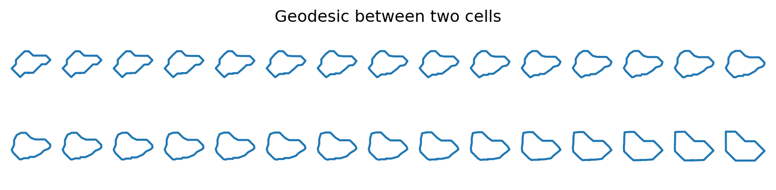
plt.figure(figsize=(12, 12))
for i in range(1, n_times - 1):
    plt.plot(geod_points[i, :, 0], geod_points[i, :, 1], "o-", color="lightgrey")
plt.plot(geod_points[0, :, 0], geod_points[0, :, 1], "o-b", label="Start Cell")
plt.plot(geod_points[-1, :, 0], geod_points[-1, :, 1], "o-r", label="End Cell")

plt.title("Geodesic for the Square Root Velocity metric")
plt.legend()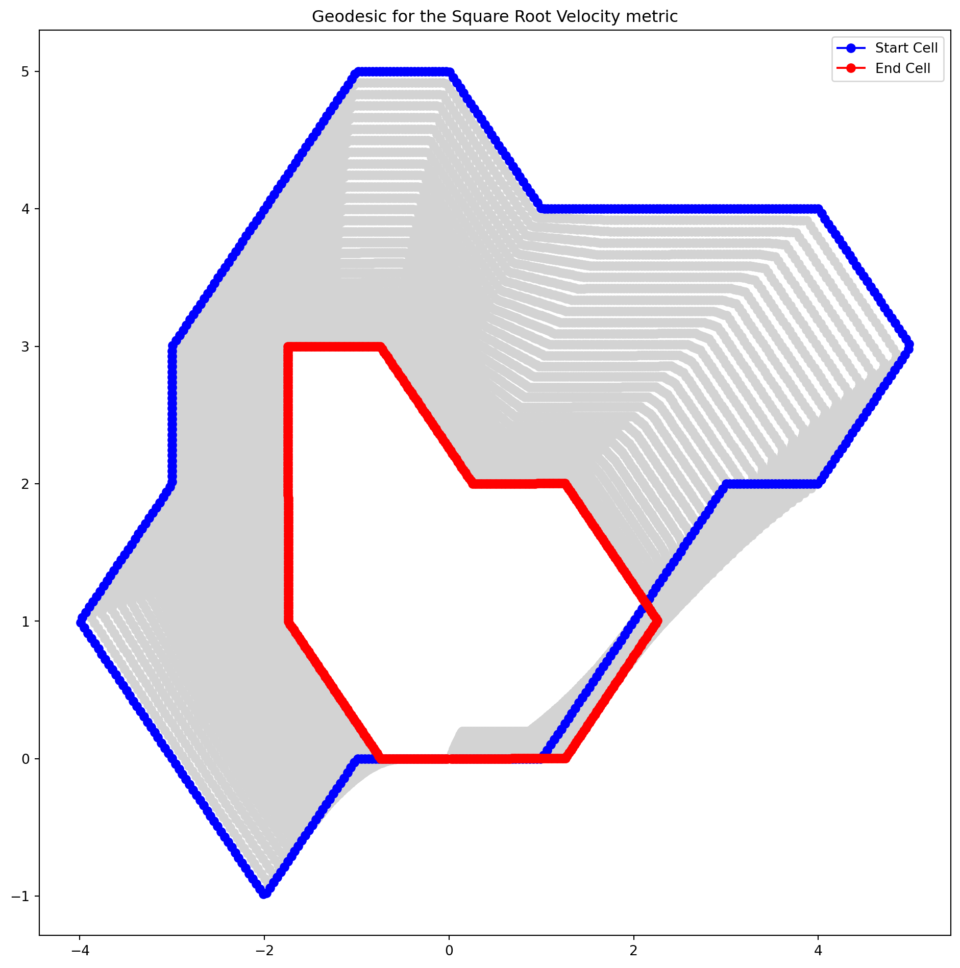
!pip freeze > requirements.txtReferences
Hillsley, Alexander, Matthew S Santoso, Sean M Engels, Kathleen N Halwachs, Lydia M Contreras, and Adrianne M Rosales. 2022. “A Strategy to Quantify Myofibroblast Activation on a Continuous Spectrum.” Scientific Reports 12 (1): 12239.